Wise
A UX teardown of the Wise home screen: identifying hierarchy failures, promotional overreach, and missed onboarding moments, then redesigning to fix them.
What Wise is
built to do
Wise (formerly TransferWise) is a fintech app built around international money movement. Send abroad, hold multiple currencies, spend globally with a debit card. All at the mid-market rate, without the bank markup.
The home screen is the operational hub. It's where users check balances, initiate transfers, and navigate the product. It should do one thing clearly: get users to their next action fast.
on one screen
home screen only
fixes only
First-time user state
Visual hierarchy auditRedesign exploration
Substituted with DM Sans
Four problems,
one screen
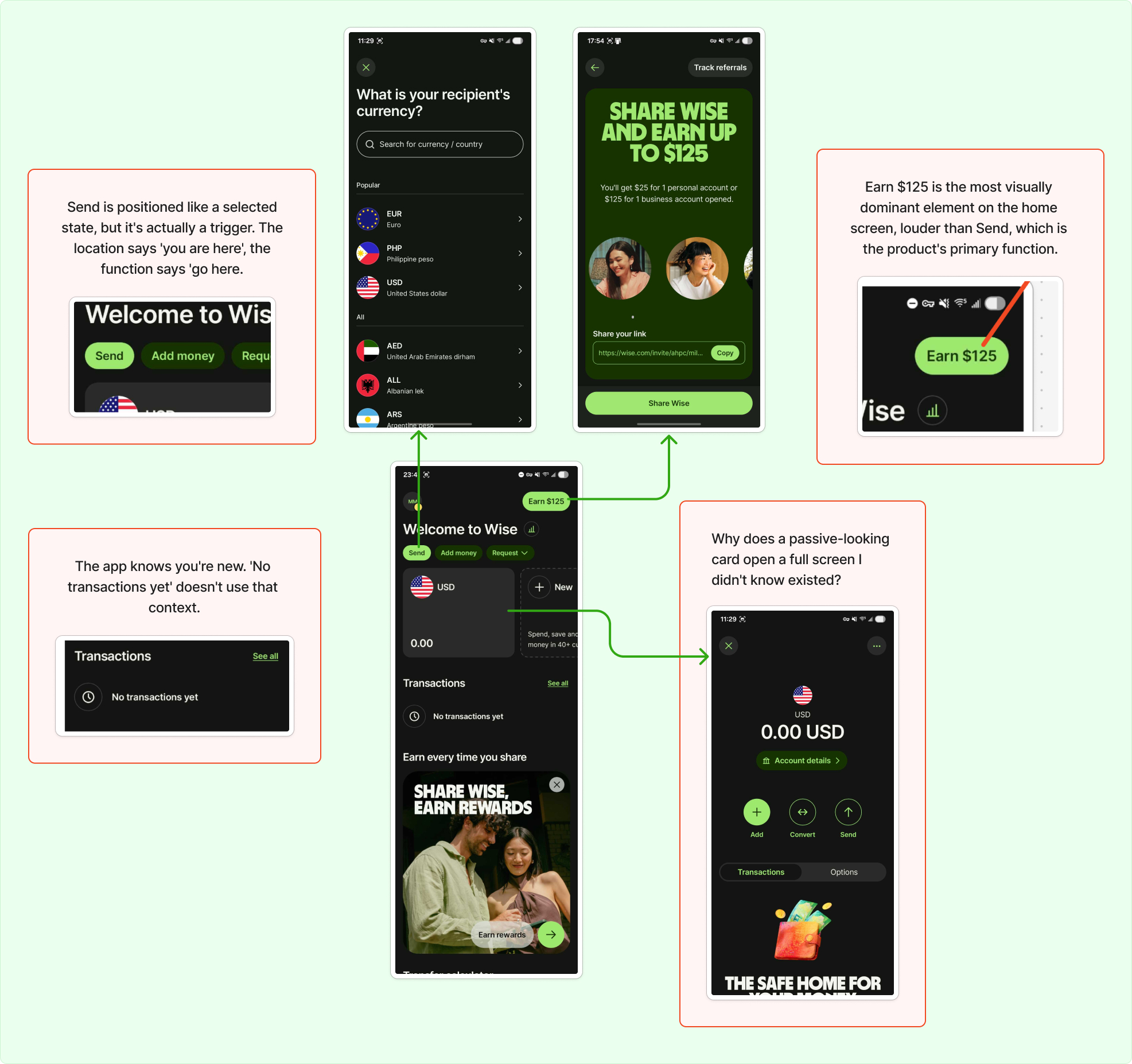
The Wise home screen has a clear hierarchy problem. Three separate issues compound each other, and a fourth compounds all of them specifically for new users.
Annotated analysis: Wise home screen (original)
Send is buried next to secondary actions
Send, Add money, and Request share the same row with equal visual weight. They're treated as peers. But Send is the product's primary action — it shouldn't be competing for attention with Request on the same line.
Primary actions need primary positioning
When the most important action is visually indistinguishable from secondary ones, users have to work to find it. On a home screen, that friction shouldn't exist.
Promotional content outranks the primary action
Earn $125 is the most dominant element on the home screen. Larger than Send, positioned at the top, impossible to miss. Wise's core value is moving money. A referral mechanic shouldn't be louder than that.
Business goal overrides user goal
The first thing a new user sees competes with what the app actually does. "Earn $125" is also ambiguous on first read. Earn how? By doing what? Visually dominant and contextually confusing.
The empty state is a dead end
The app knows this is a new user with zero activity. "No transactions yet" confirms that. Nothing else. No next step, no prompt, no direction. A moment of high context, completely wasted.
New users need a next step, not a confirmation of absence
Empty states are a design moment. The app knows exactly who you are: you just signed up, you have no history. That context should be used to pull the user toward their first action.
The balance card hides its depth
Tapping the balance card opens a full screen with actions, settings, and account details that don't exist anywhere else. Nothing on the card signals it's interactive. No chevron, no border, no hint.
Key features are effectively invisible
Add, Convert, Account details, APY settings — all buried behind a card that looks passive. Users who don't accidentally tap it will never know those features exist. Discovery by accident is not a UX strategy.
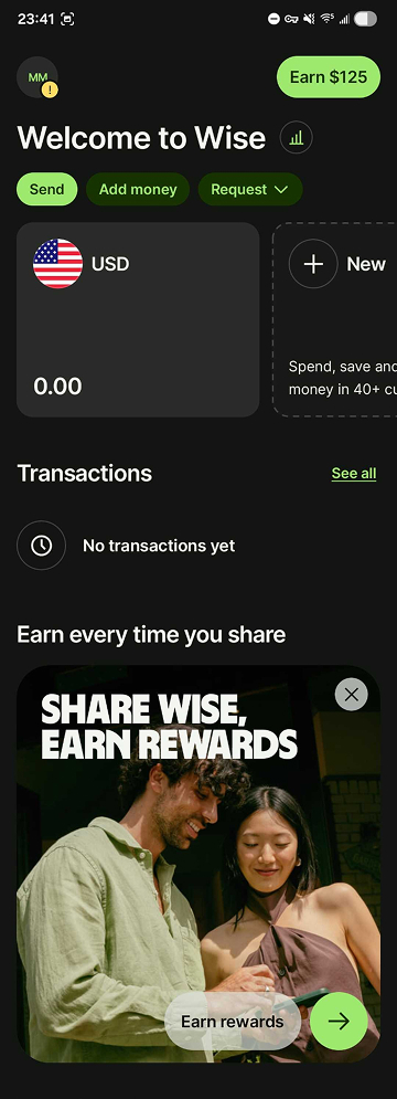
Same screen,
clearer intent
No added features, no structural overhaul. The redesign addresses all four issues through hierarchy, signifier correction, and one additional sentence in the empty state.
 Before: original home screen
 After: redesigned home screen
Send now has primary positioning
Send is now a filled green pill, visually distinct from Add money and Request. It reads as the primary action, not a peer of the secondary ones.
Visual weight matches action hierarchy
The filled treatment gives Send clear dominance. Add money and Request remain outlined: present, but subordinate. The user's eye lands on Send first.
Promotional content moved below the fold
Earn $125 is demoted to a dismissable card below the fold. The redundant heading above it is removed. The top of the screen is reserved for what the product actually does.
Referral card stays, just in its place
The referral mechanic isn't removed, it's repositioned. It still exists and is dismissable. But it no longer competes with Send for visual dominance on first open.
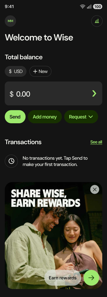
The empty state now points forward
"No transactions yet. Tap Send to make your first transaction." Same space, one added sentence. The app now uses what it knows about the user to point them forward.
Context used, not wasted
The fix isn't visual. It's a single line of copy. The moment a new user lands on an empty screen is the highest-context moment in the onboarding journey. One sentence makes it useful.
The card now signals it's interactive
A green chevron and subtle border communicate that the card is interactive. The depth is still there. Now the user knows to look for it.
Chevron + border treatment
A right-pointing chevron and a green border shift the card from passive display to navigable element. The green ties visually to Send, reinforcing the interactive language of the screen.
Hierarchy
doing its job
The redesigned home screen does one thing the original doesn't: it's legible on first open. The primary action is obvious, the promotional content doesn't compete, and a new user has somewhere to go.
No added features, no structural overhaul. Just hierarchy doing its job.
Scope & Limitations — This is a single-screen teardown focused on the home screen in a new user state. It doesn't account for returning user behavior, A/B testing data, or Wise's internal product goals. The issues identified are based on heuristic analysis and visual inspection only.
Sometimes the fix
is one sentence
The most interesting part of this teardown was realizing how much a single screen can communicate, or fail to. The empty state callout was the sharpest lesson: the fix wasn't visual at all, it was one line of copy. Good UX isn't always about what you design. Sometimes it's about what you say, and when.