Coach
A credit management app designed for clarity — turning financial anxiety into confident, informed action.
Designed for
clarity
Most credit tools assume users already understand the system. They don't. Coach is a conceptual UX case study focused on reducing financial hesitation by making credit impact visible and easier to interpret.
The goal was not to build a feature-heavy app, but to explore how clearer structure and contextual explanation could improve confidence in credit decisions.
in discovery phase
informing the design
credit confidence
UI DesignInteraction Design
FigJam
Competitive audit1 usability session
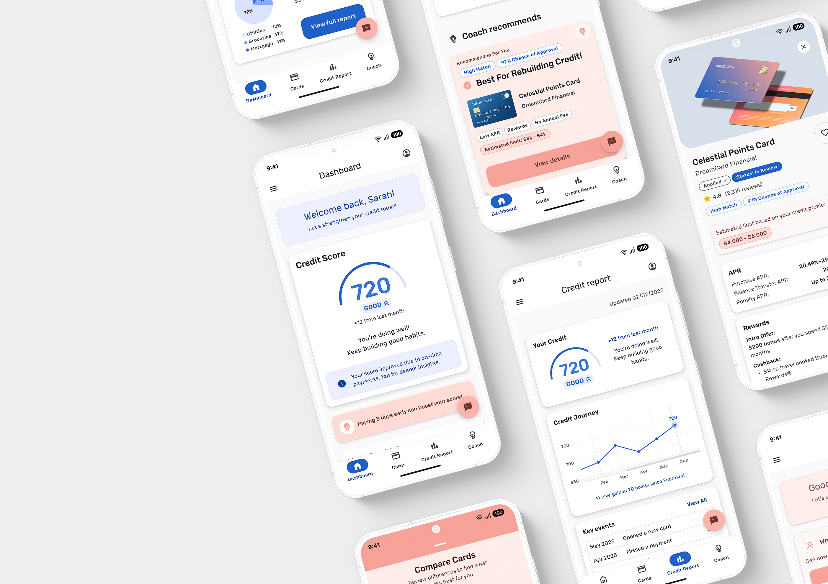
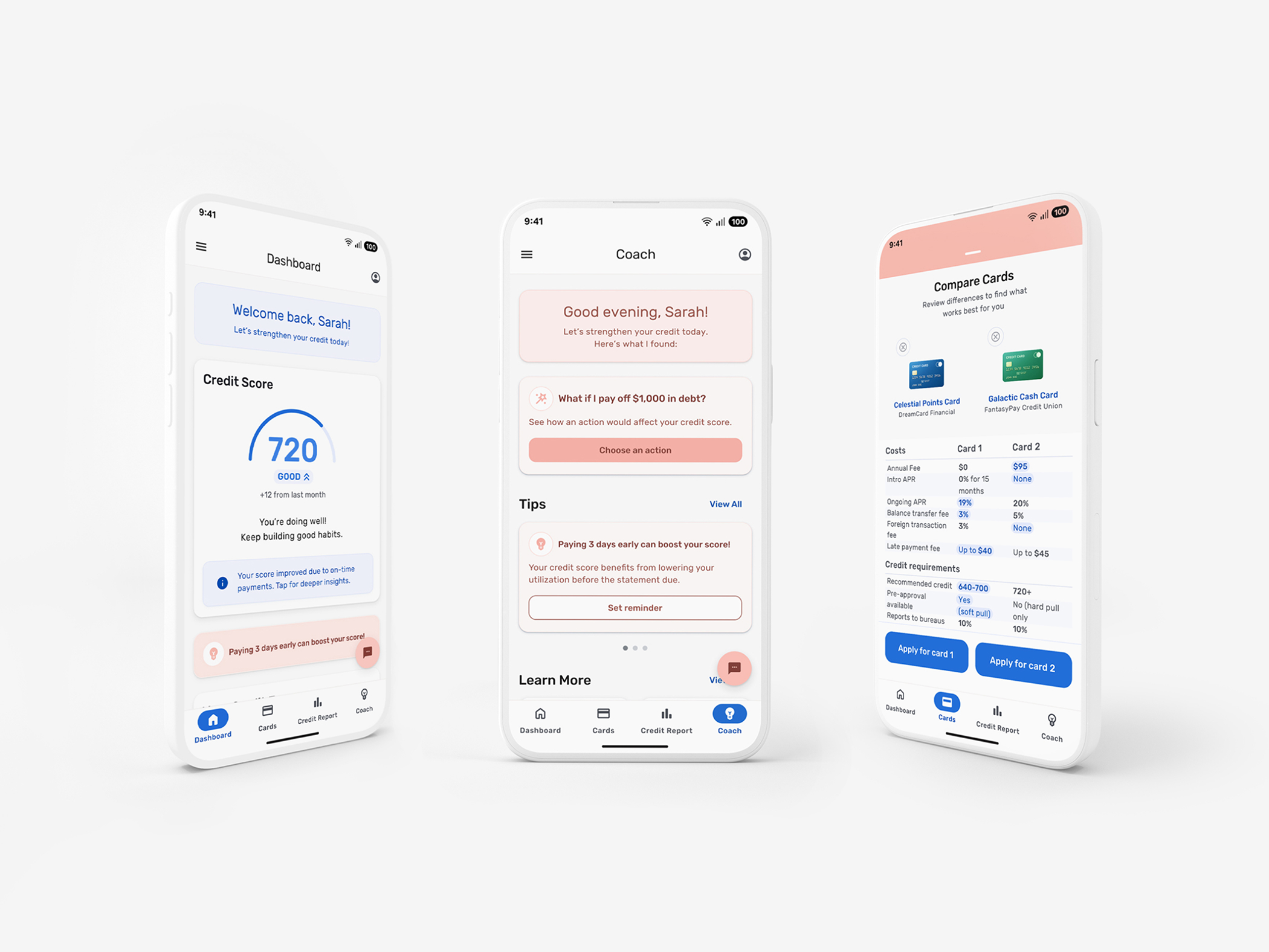
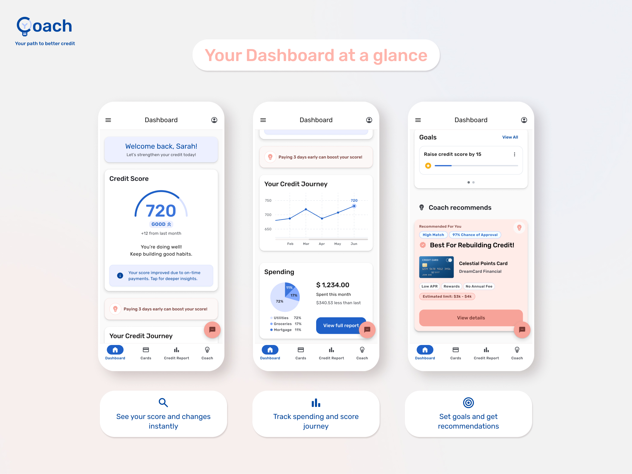
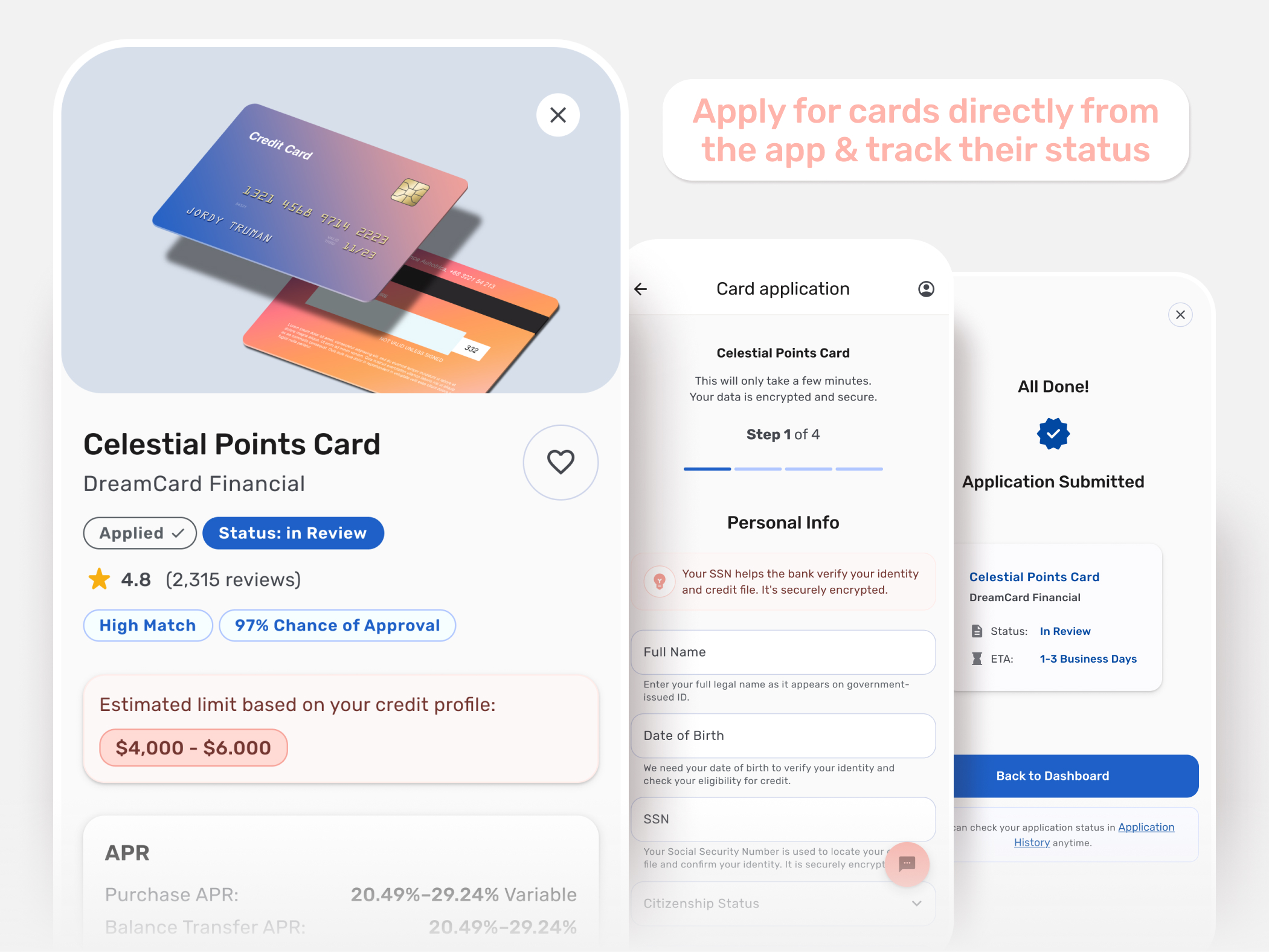
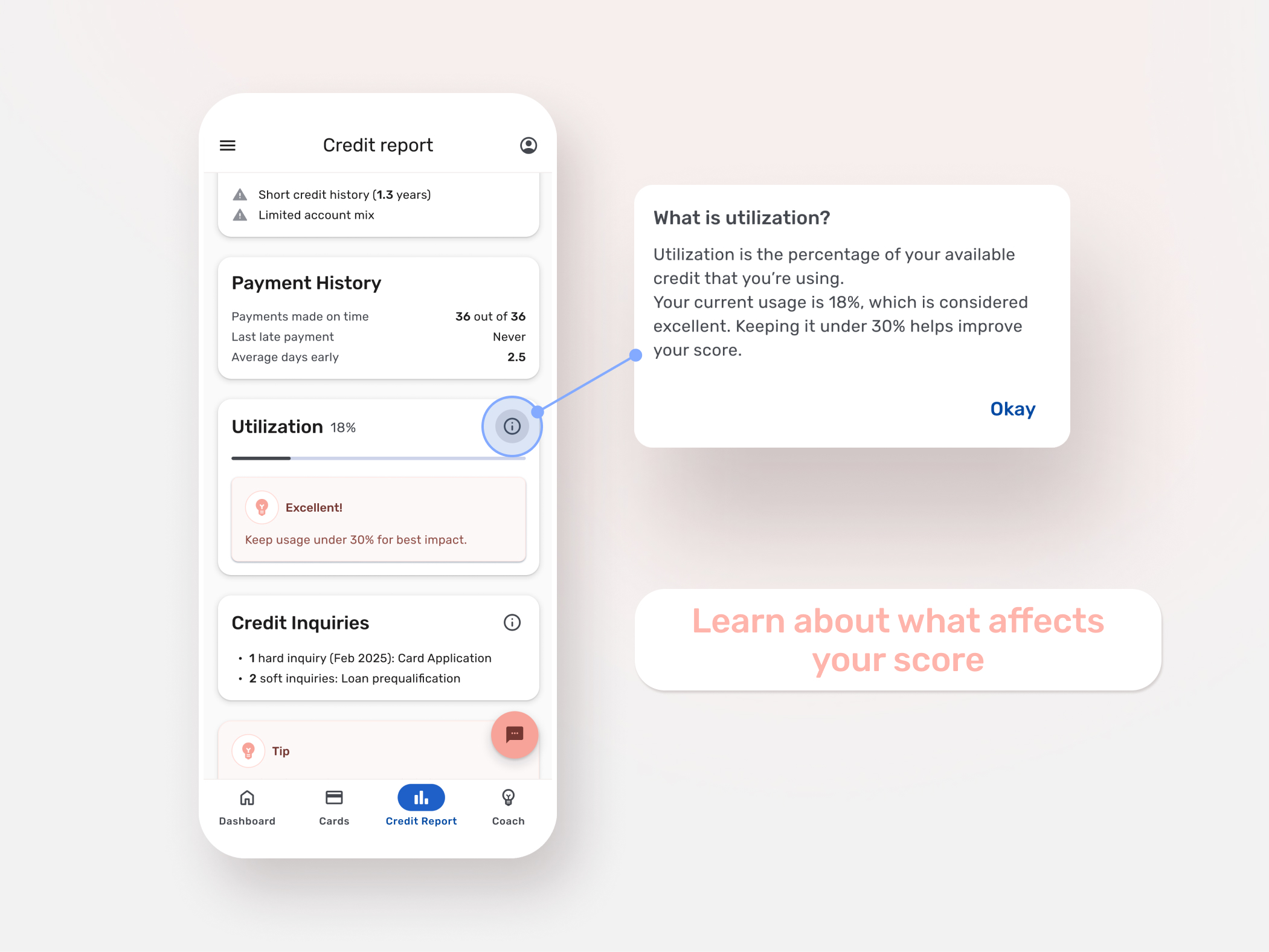
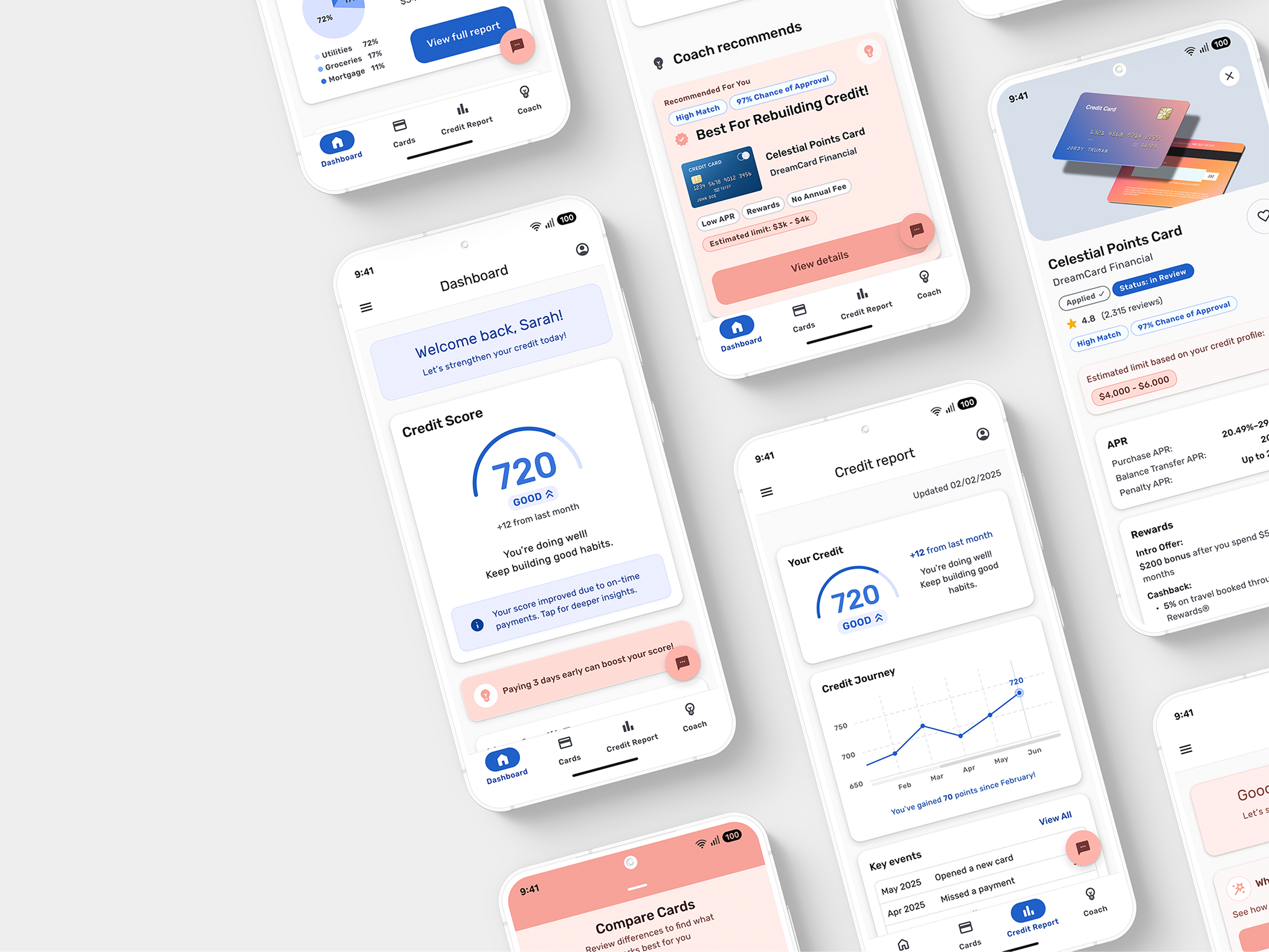 Final design — scroll down for full gallery
Credit tools
overwhelm people
Most credit apps optimize for information density, not comprehension. Scores are displayed without contextual explanation. Financial jargon sits without inline support. Card recommendations appear without clear reasoning. Emotional reassurance is completely absent.
The result: users hesitate. They understand what their score is, but not what to do next. That gap became the core problem to solve.
"I'm scared applying will hurt my score, so I just don't."
— User research finding
Understanding
the gap
Research began with a competitive audit of leading credit tools — Credit Karma, Experian Boost, myFICO, NerdWallet, and Mint — mapping both their strengths and the structural gaps that consistently left users underserved.
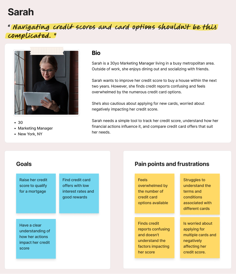 Primary persona: Sarah, 30 — Marketing Manager, New York
The primary persona, Sarah, is a busy professional planning for a mortgage. She knows credit matters, but unclear language and too many options slow her down and spike her stress.
Her three core needs shaped every design decision: fast clarity on her current score, a sense of how actions affect outcomes, and confidence in comparing cards.
If Sarah can have a simple, intuitive tool to track her credit score, educate her on how financial decisions affect her score, and offer personalized recommendations, Then she will have a clearer understanding of her credit score, and be able to manage it more confidently and stress-free.
From uncertainty
to decision
Mapping Sarah's full journey — from checking her score to applying for a card — surfaced emotional spikes and friction points that revealed exactly where clarity delivers the most value.
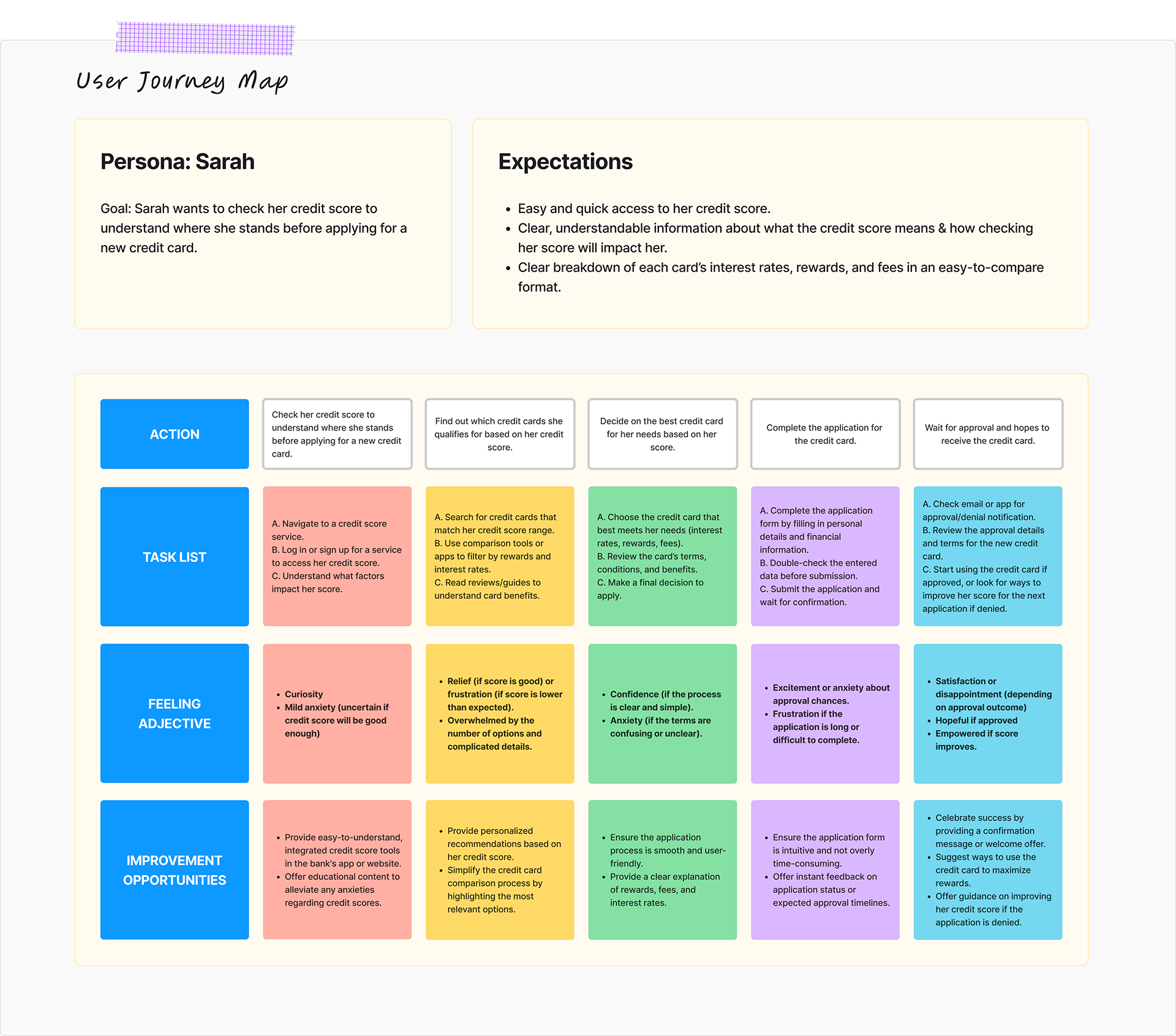 User Journey Map — Persona: Sarah
The core journey follows three stages: Understand (score and drivers at a glance), Improve (tips, simulations, and plain-language explanations), and Take Action (compare card options with confidence).
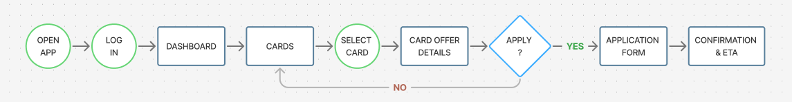 User Flow — Dashboard to card application
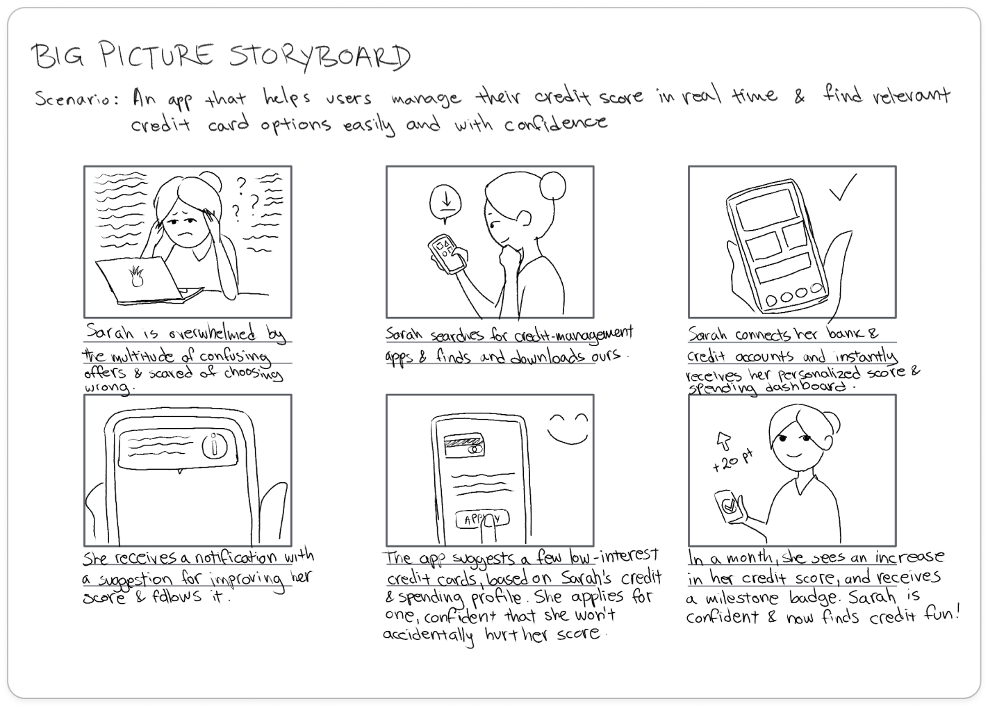 Big Picture Storyboard
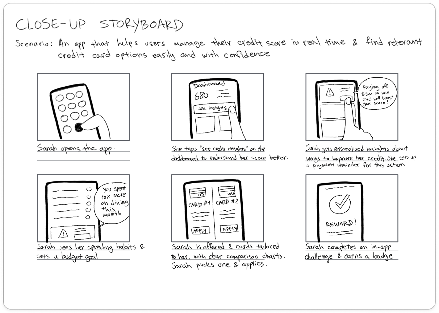 Close-up Storyboard
Structure
before style
The process kicked off with hand-drawn sketches to test hierarchy, layout, and flow. The priority was surfacing key credit information immediately while keeping secondary details accessible without clutter.
.png)
.jpg)
What testing
surfaced
One moderated usability session focused on two tasks: interpreting a credit score and understanding its drivers, and comparing and selecting a card option. Insights are directional, not statistically validated.
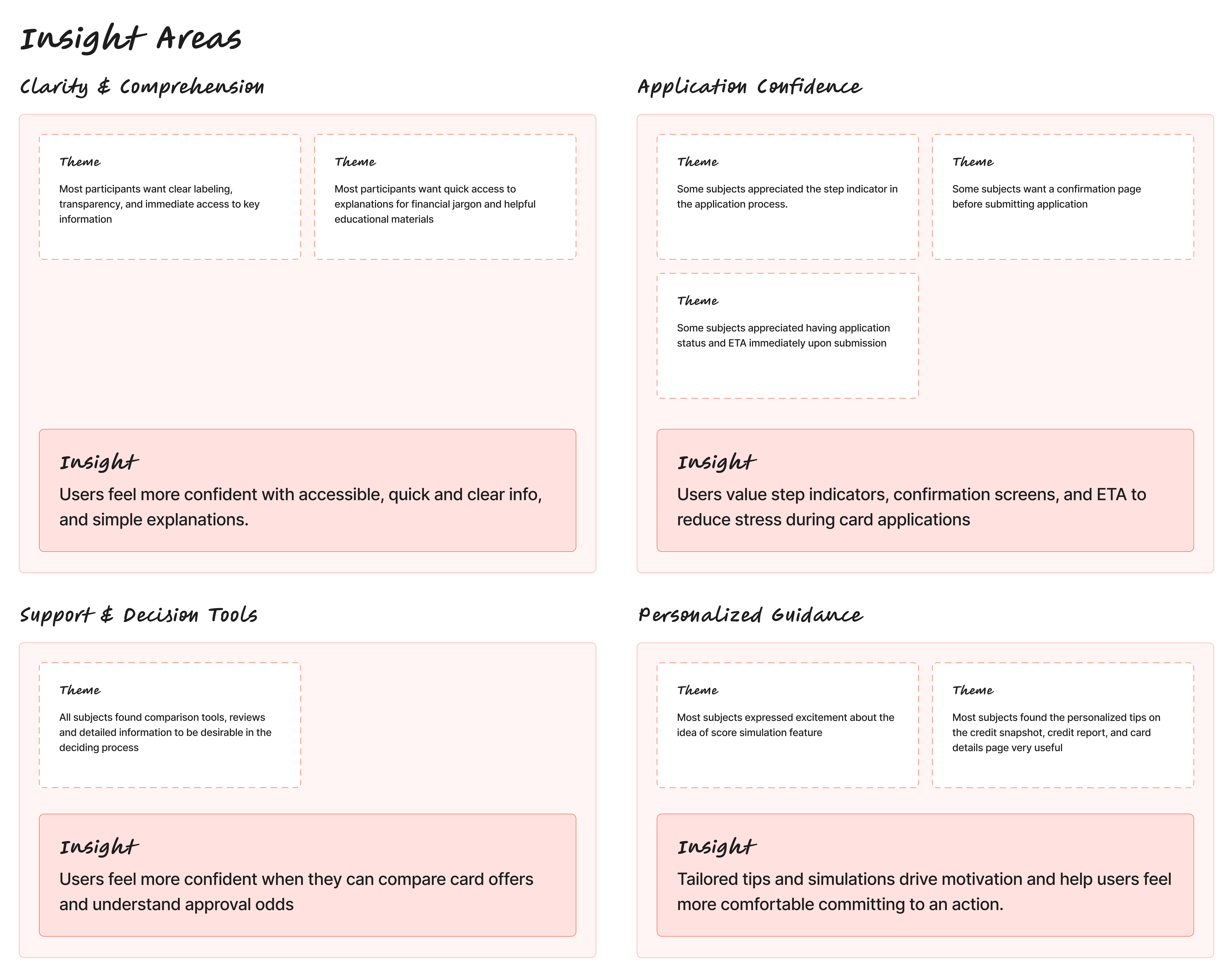 Insight areas from usability testing
Users Feel More Confident with Accessible, Clear Info
The participant felt more comfortable with clear labeling, transparency, and immediate access to information and explanations.
Score visibility and plain language guidance
Prioritized score visibility and placed guidance messages directly on the dashboard. Added inline explanations and tooltips throughout.
Transparency Increases Confidence During Applications
The participant appreciated step indicators during the application flow, but felt uncomfortable with the lack of a confirmation screen before submission.
Step indicators, status ETA, and a confirmation screen
Kept the step indicators and application status, and introduced a confirmation screen before final submission.
Users Need Better Tools to Make Informed Card Choices
The participant feels more confident when they can compare card offers and understand approval odds before applying.
Comparison feature, card ratings, and approval chances
Added a comparison feature, card ratings, and match criteria and approval chances explanations.
Personalized Guidance Motivates Action
Tailored tips and simulations drive motivation and help users feel more comfortable committing to an action.
Expanded Coach feature with advice, reminders, and encouragement
Expanded the Coach feature to include actionable advice, reminders, and encouragement messages tied to score milestones.
Clarity, confidence,
calm language
The final UI brings clear hierarchy, controlled spacing, and intentional interaction patterns together — so users spend less time guessing and more time acting.
Scope & Limitations — This case study was conceptual in nature. Research included a competitive audit, app store review analysis, and one exploratory usability session. Because of the limited sample, insights are directional and intended to inform further investigation rather than generalize to all users.
Emotional design
needs validation
This project suggested that emotional reassurance and clear contextual feedback could reduce anxiety. In future, broader testing would be needed to validate these patterns across a wider user group.