Mixpanel
A dashboard redesign focused on four friction points: empty states, data hierarchy, navigation, and cross-section consistency. No added features. Just clarity doing its job.
Complexity stacked
on complexity
Mixpanel is a B2B analytics platform used by product teams to track behavior, revenue, and retention. The tool itself is powerful. The interface reflects years of accumulated decisions.
This redesign focuses on four places where that complexity creates real friction: empty states, data hierarchy, navigation, and cross-section consistency. No feature additions. No structural overhauls. Just the interface making better use of what already exists.
identified and fixed
across the dashboard
structure only
FigJam annotationWireframe explorationHigh-fidelity redesign
MRR DashboardChurn & RetentionDiscover · Data section
Navigation & IAEmpty state designVisual consistency
Four problems,
one product
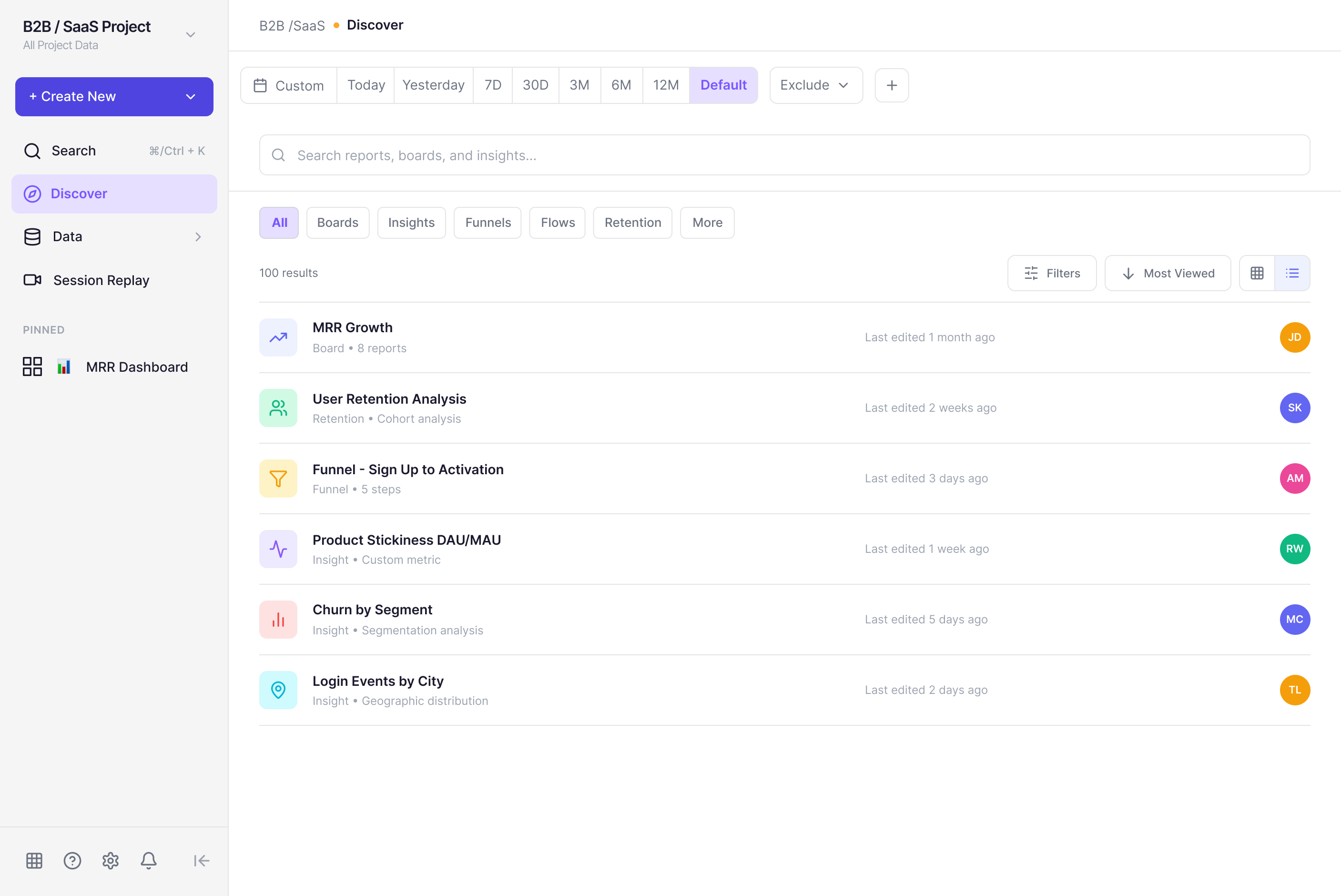
The audit covered the full dashboard experience, from first login to active use. Four distinct issues emerged, each affecting a different user type and a different part of the interface.
The dashboard looks broken before it's begun
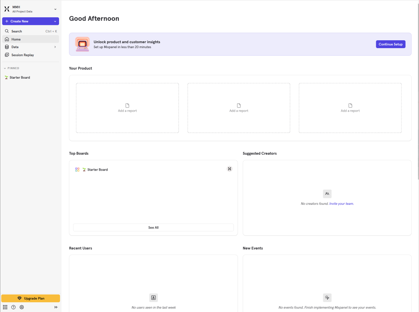
New users land on a screen structured like a fully populated dashboard. Hollow card grids, competing sections, no clear first action.
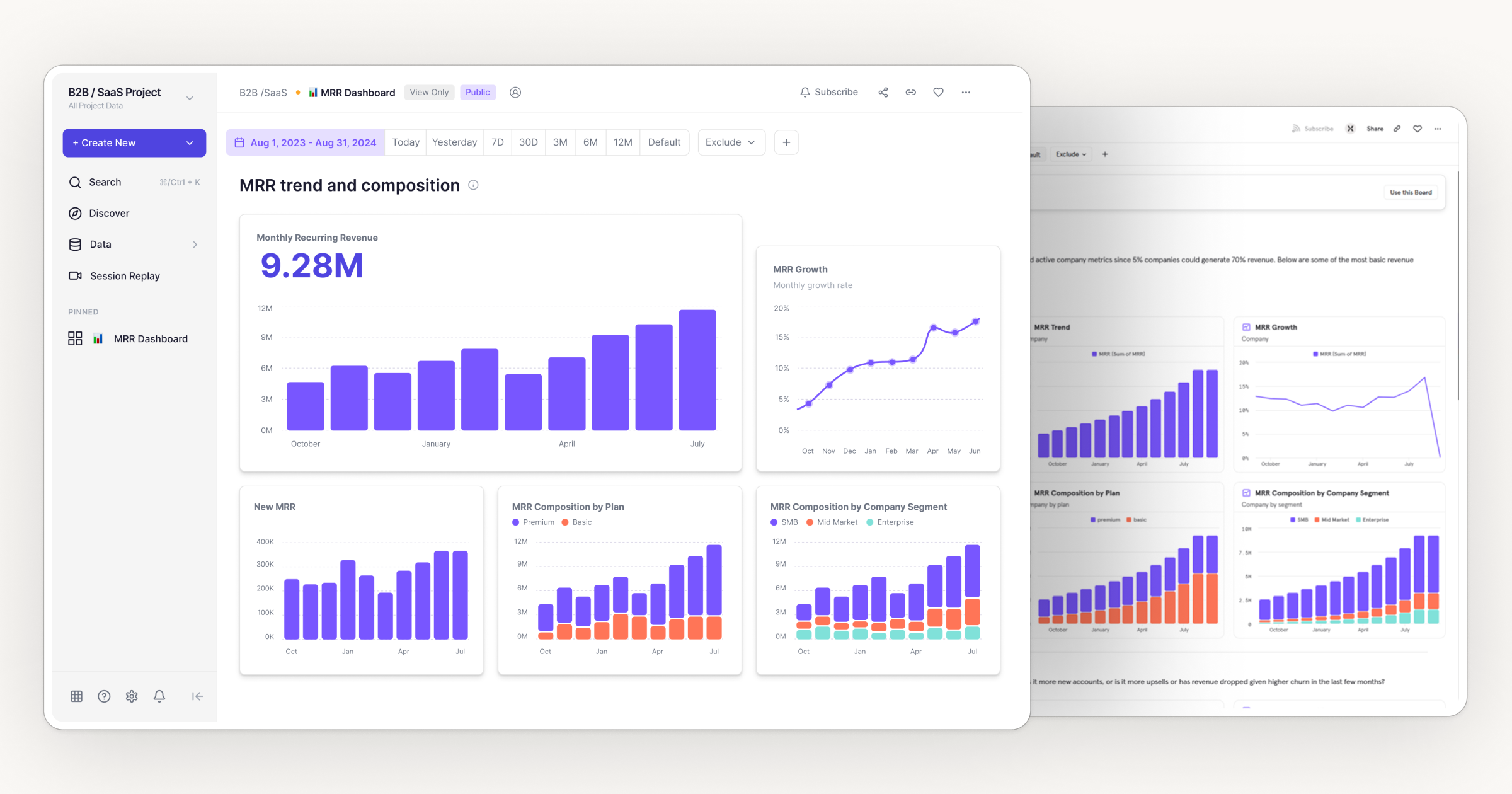
The primary KPI competes with everything around it
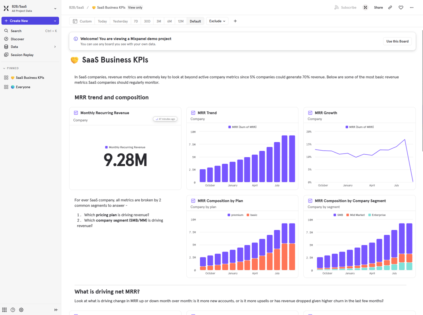
The MRR value (9.28M) sits in a three-column grid where supporting charts carry the same visual weight. Nothing establishes priority.
Browsing by type is a configuration step, not a default
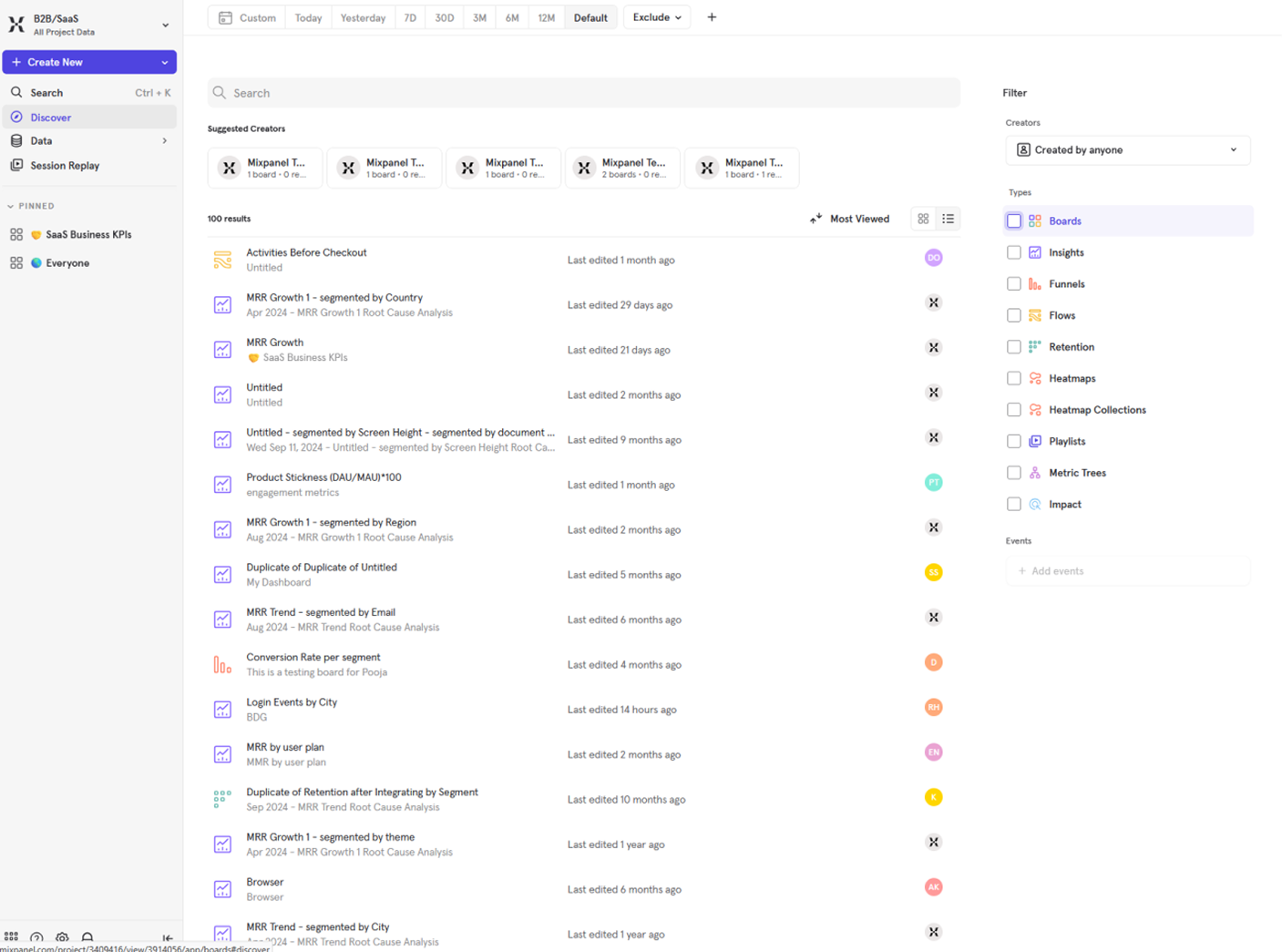
100 unsorted results on every visit. Type filtering is pushed into a persistent right panel requiring deliberate setup.
Events, Users, and Lexicon feel like different products
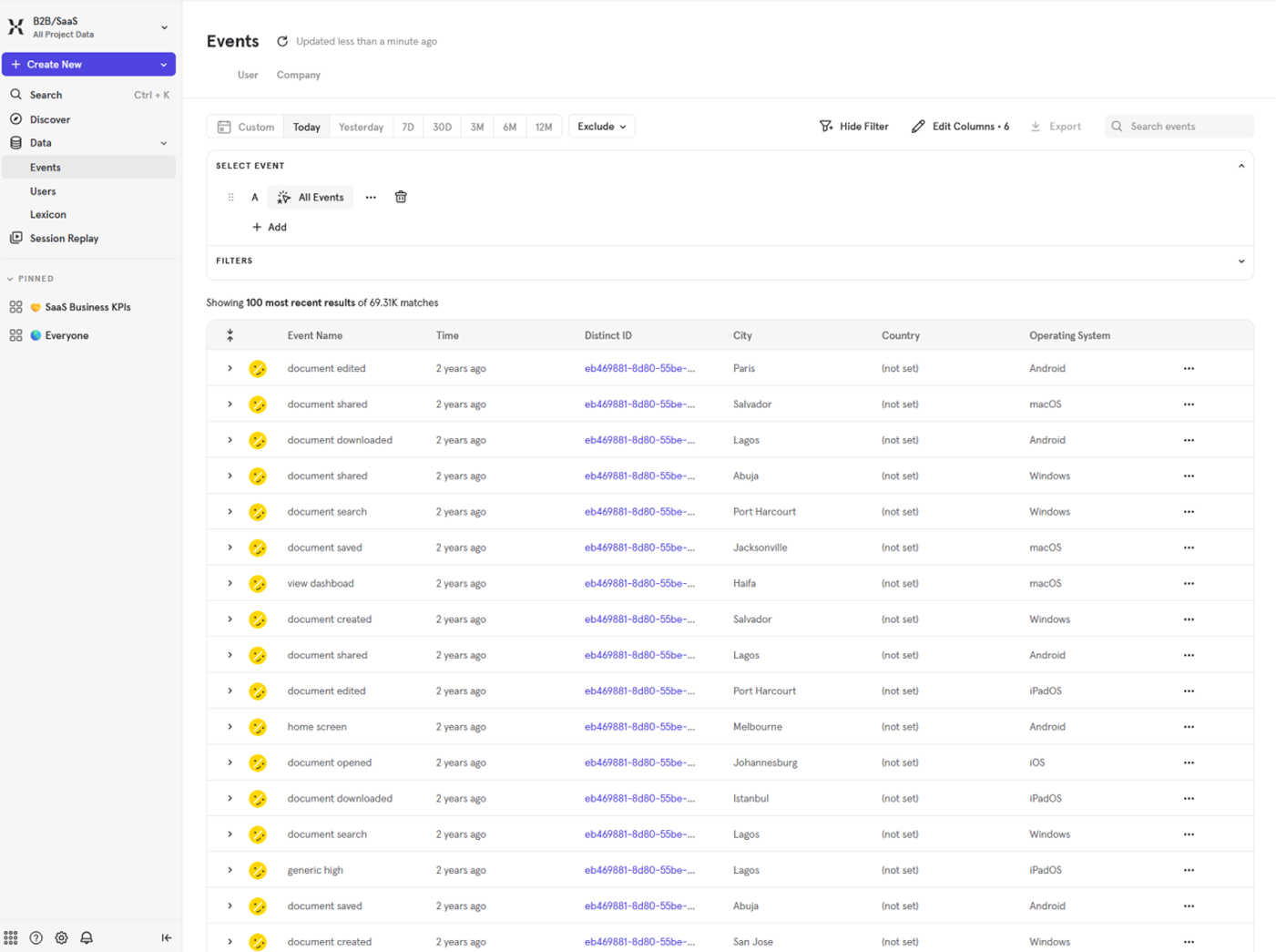
Each view under Data follows completely different layout logic despite sitting under the same navigation parent.
Four problems,
four constraints
Each finding pointed directly to a design decision. No exploration needed. The problems were specific enough that the direction was already implied.
What changed
and why
Five screens across the core dashboard experience. Each one maps directly to a finding from the audit. Mixpanel's original color language is preserved throughout.
A skeleton preview behind one clear action
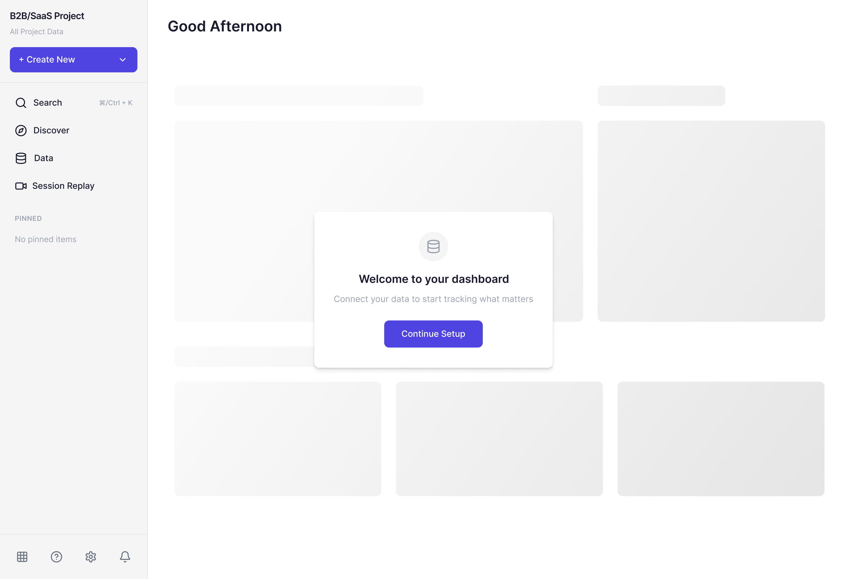
A skeleton preview of the populated dashboard sits behind a focused setup modal. One headline. One action. The surrounding structure shows what the product becomes.
Three tiers. One entry point.
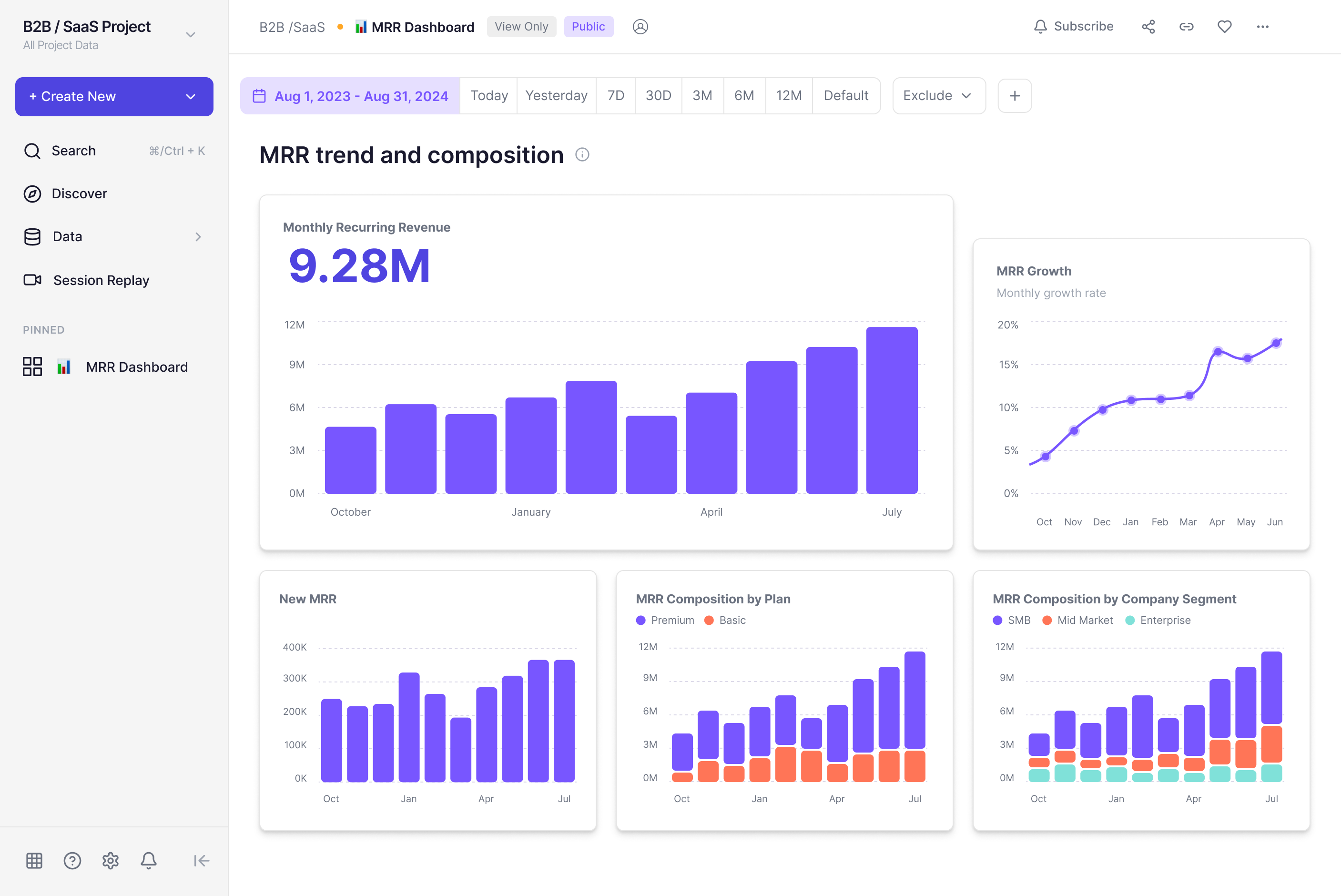
One dominant KPI card, one supporting chart, three secondary charts in a subordinate row. Hierarchy is structural. Inline explanatory text replaced with contextual tooltips.
Context and metrics grouped as one unit

Context text and metric cards wrapped inside a single container. A horizontal divider separates grouped metrics from deep-dive charts below.
Browsing first, filtering on demand
Type filter tabs at the top make category browsing the primary interaction. Secondary filters move behind an on-demand button.
One template, three views
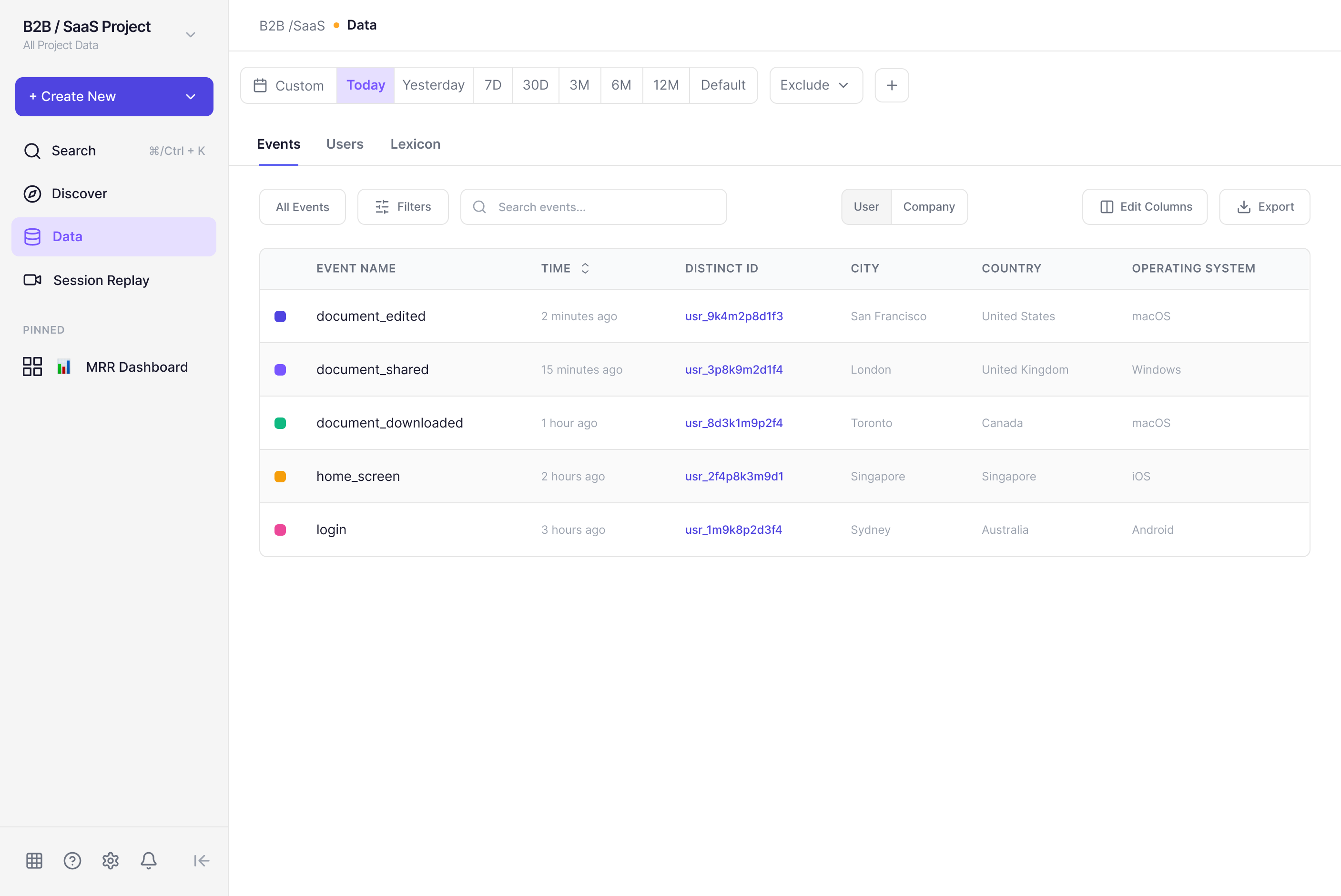
One consistent layout template across Events, Users, and Lexicon. A top-level tab bar makes the relationship explicit. Same header. Same toolbar. Same table structure.
Side by side
Original on the left. Redesign on the right. Same product, different decisions.
Structure doing
its job
Each screen change maps directly to a finding. Nothing was redesigned for its own sake. The argument throughout is structural: hierarchy, grouping, defaults, consistency. Mixpanel's color language and core interaction patterns are preserved.
The result isn't a reimagined product. It's the same product with less friction in the places where friction compounds most.
Scope & Limitations — This is a five-screen redesign based on heuristic analysis and live product audit of the demo environment. It doesn't account for Mixpanel's internal product goals, A/B testing data, or full user research. Findings are based on visual inspection, interaction testing, and established UX principles.
The audit is
the unlock
The most useful part of this project was learning to audit a product I didn't fully understand domain-wise. The hierarchy problems, the missing visual relationships, the defaults that don't serve the majority use case — those don't require domain expertise to identify. They require eyes and a frame.
The other thing: Figma Make accelerated the UI phase significantly, but every useful output still required manual reasoning. The tool generates. The decisions still have to come from somewhere.