works

Coach app

Coach is a conceptual credit-management tool built to strip away ambiguity and anxiety from credit decisions.

Category • 

Conceptual Study

service • 

UX / UI Design

Completed on •

August 1, 2025

Role •  

Solo UX/UI Designer

Tools •  

Figma, FigJam, Google Sheets, Photoshop

Header image of the finalized mockups

Coach - Credit Management Designed for Clarity

Most credit tools assume users already understand the system. They don’t.

Coach is a conceptual UX case study focused on reducing financial hesitation by making credit impact visible and easier to interpret. The goal was not to build a feature-heavy app, but to explore how clearer structure and contextual explanation could improve confidence in credit decisions.

This project was exploratory in scope and included limited usability validation.

The Problem

Most credit tools overwhelm people. Users don’t actually understand how credit works or which cards make sense for their situation. The current solutions present complexity without explanation, which makes people unsure and hesitant.

The Goal

Design an experience that makes credit approachable and actionable. Users should be able to see, interpret, and act on credit info without unnecessary confusion. Confidence should replace anxiety.

Three high-fidelity mobile screens showing dashboard with 720 credit score, Coach screen with debt simulation prompt, and card comparison table with fees and APR details.

Research

This project began with exploratory research to understand where confusion happens in existing credit tools and why users hesitate to take action.

Methods included:

  • Competitive audit of leading credit and finance apps
  • Review analysis of user frustrations in app store feedback
  • One moderated usability session focused on score interpretation and card comparison

Because this was a conceptual study, findings are directional rather than statistically validated.

What Competitors Get Wrong

Most credit apps optimize for information density, not comprehension.

Patterns I saw repeatedly:

  • Scores displayed without contextual explanation
  • Heavy financial jargon without inline support
  • Card recommendations shown without clear reasoning
  • Emotional reassurance completely missing

The result: users hesitate. They understand what their score is, but not what to do next.

That became the core problem to solve.

“I’m scared applying will hurt my score, so I just don’t.”

Persona

Primary persona: Sarah

A busy professional planning for a mortgage. She knows credit matters, but unclear language and too many options slow her down and spike her stress.

What Sarah Needs:
  • Fast clarity on her current score.
  • A sense of how actions affect outcomes.
  • Confidence in comparing cards.

Problem Statement

People trying to improve credit feel stuck. They don’t know how actions shift scores, and financial products feel intimidating because existing tools don’t provide enough context, clear explanations, or reassurance. That gap makes users avoid action.

Sticky note style slide titled “Problem Statement” describing Sarah, a 30-year-old marketing manager who needs a simple, user-friendly way to track her credit score, understand financial impact, and find relevant credit card offers. It highlights her fear of negatively affecting her credit score and feeling overwhelmed by many card options.

Hypothesis Statement

If the app explains credit impacts clearly and tailors guidance to the user, people will feel informed and confident enough to manage their credit and take next steps.

Sticky note style slide titled “Hypothesis Statement” explaining that if Sarah has an intuitive tool to track her credit score, learn how financial decisions affect it, and receive personalized recommendations, she will better understand her credit and manage it more confidently and with less stress.

Scope & Limitations

This case study was conceptual in nature. Research included a competitive audit, review analysis of external tools, and one exploratory usability session. Because of the limited sample, insights are directional and intended to inform further investigation rather than generalize to all users.

Journey Map & Task Flow

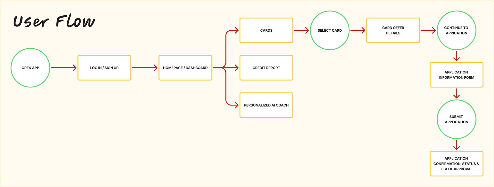
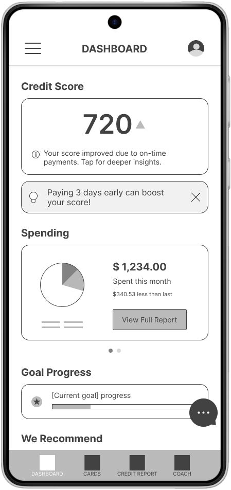
I mapped the journey from uncertainty to decision. That revealed emotional spikes and friction points, letting us refine where clarity delivers the most value.

User journey map for Sarah outlining actions, tasks, emotions, expectations, and improvement opportunities across the credit card application process.

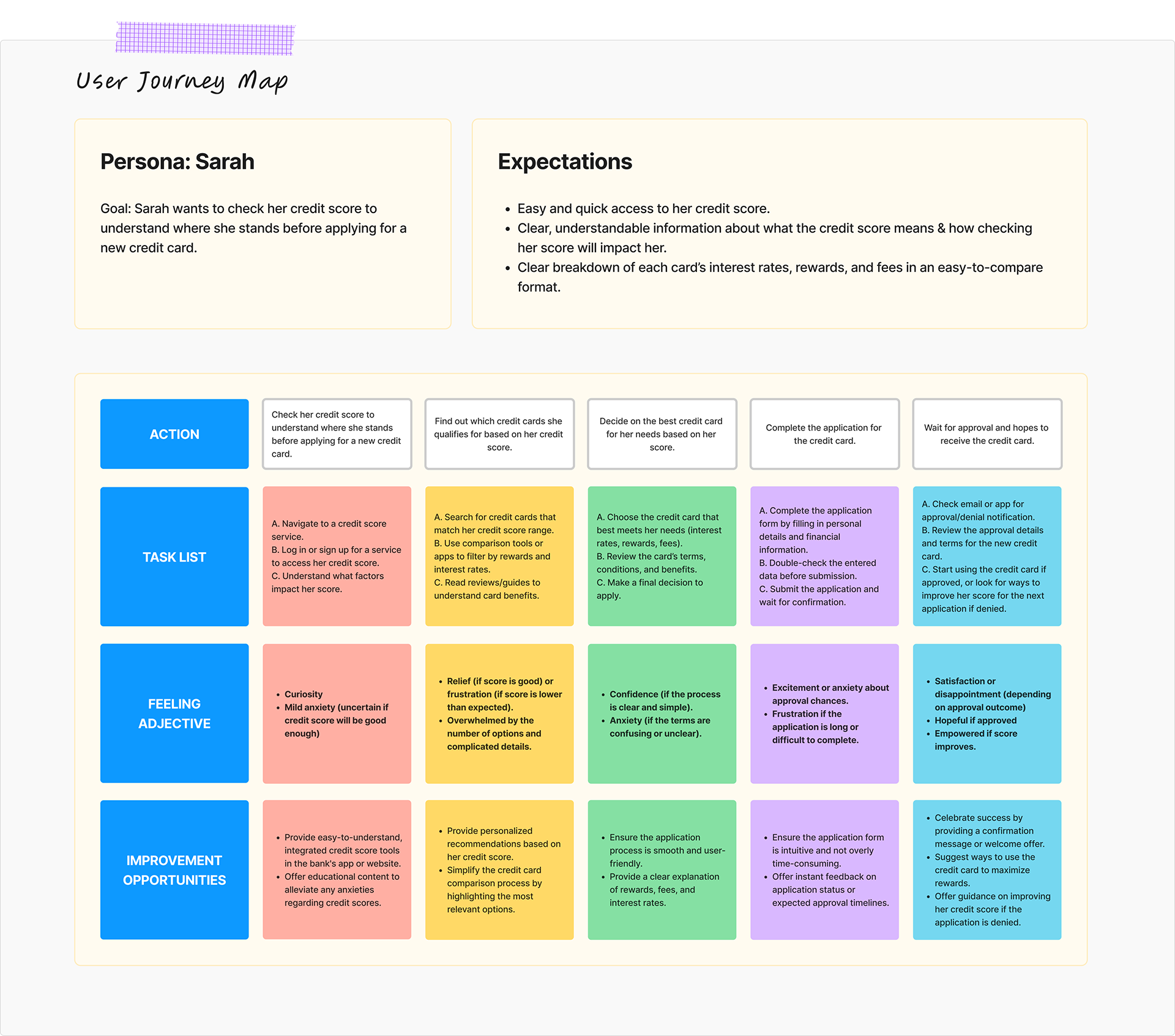
The core journey follows three stages:

  • Understand: show score and drivers at a glance.
  • Improve: give tips, simulations, and clear explanations.
  • Take Action: let users compare card options with confidence.
User flow diagram showing path from app open to login, dashboard, card selection, application form, submission, and approval confirmation.

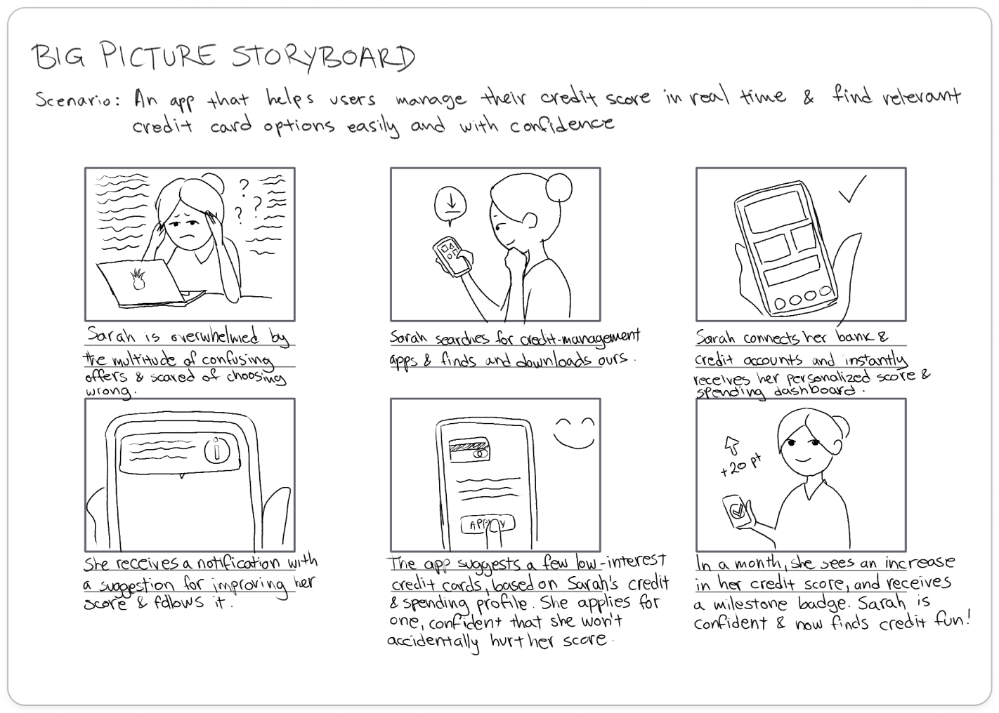
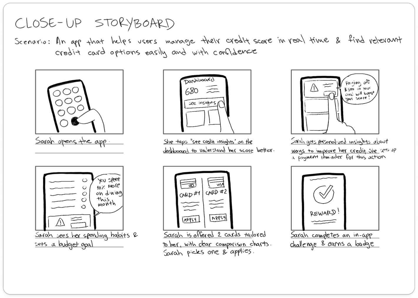
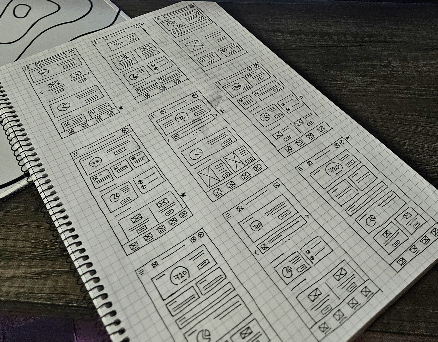
I also created both big-picture and close-up storyboards to visualize user motivation, emotional state, and context at different moments in the experience.

No items found.

Wireframes & Early Concepts

I kicked off with hand-drawn sketches to test hierarchy, layout, and flow. The focus was making key credit info easy to see right away while keeping secondary details accessible without clutter.

Once the core structure worked, I moved into low-fi wireframes in Figma. This made it easier to iterate flow and layout before major visual styling.

No items found.

Here is what the earliest user flow looked like on low-fidelity wireframes.

Exploratory Usability Findings

Usability testing in this conceptual study involved one moderated session where the participant completed key tasks like interpreting a credit score, comparing card options, and using the Coach feature. The goal was to observe points of confusion and reactions to prototype interactions.

The moderated session focused on two tasks:

  1. Interpreting a credit score and understanding its drivers
  2. Comparing and selecting a credit card option

Key Insights & Design Responses

Research insights board divided into four sections: Clarity and Comprehension, Application Confidence, Support and Decision Tools, and Personalized Guidance. Each section lists themes from user research and summarizes key insights, including the need for clear labeling, step indicators, card comparisons, approval odds, and tailored simulations.

Insight: Users Feel More Confident with Accessible, Quick and Clear info, and Simple Explanations
The participant felt more comfortable with clear labeling, transparency, and immediate and easy access to information and explanations.

Answer: I prioritized score visibility and placed guidance messages directly on the dashboard. I also added inline explanations, tooltips, and plan language guidance throughout the app.

Mobile dashboard screen showing 720 credit score, spending summary of $1,234, goal progress bar, and navigation tabs.
Credit report screen with 720 score and tooltip explaining credit utilization after tapping information icon.

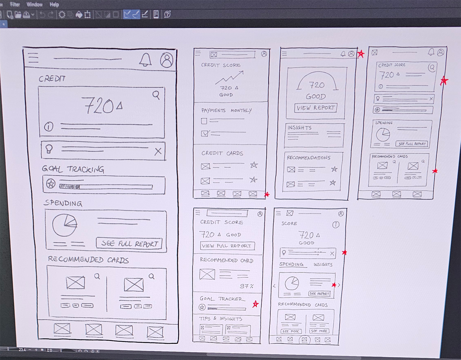
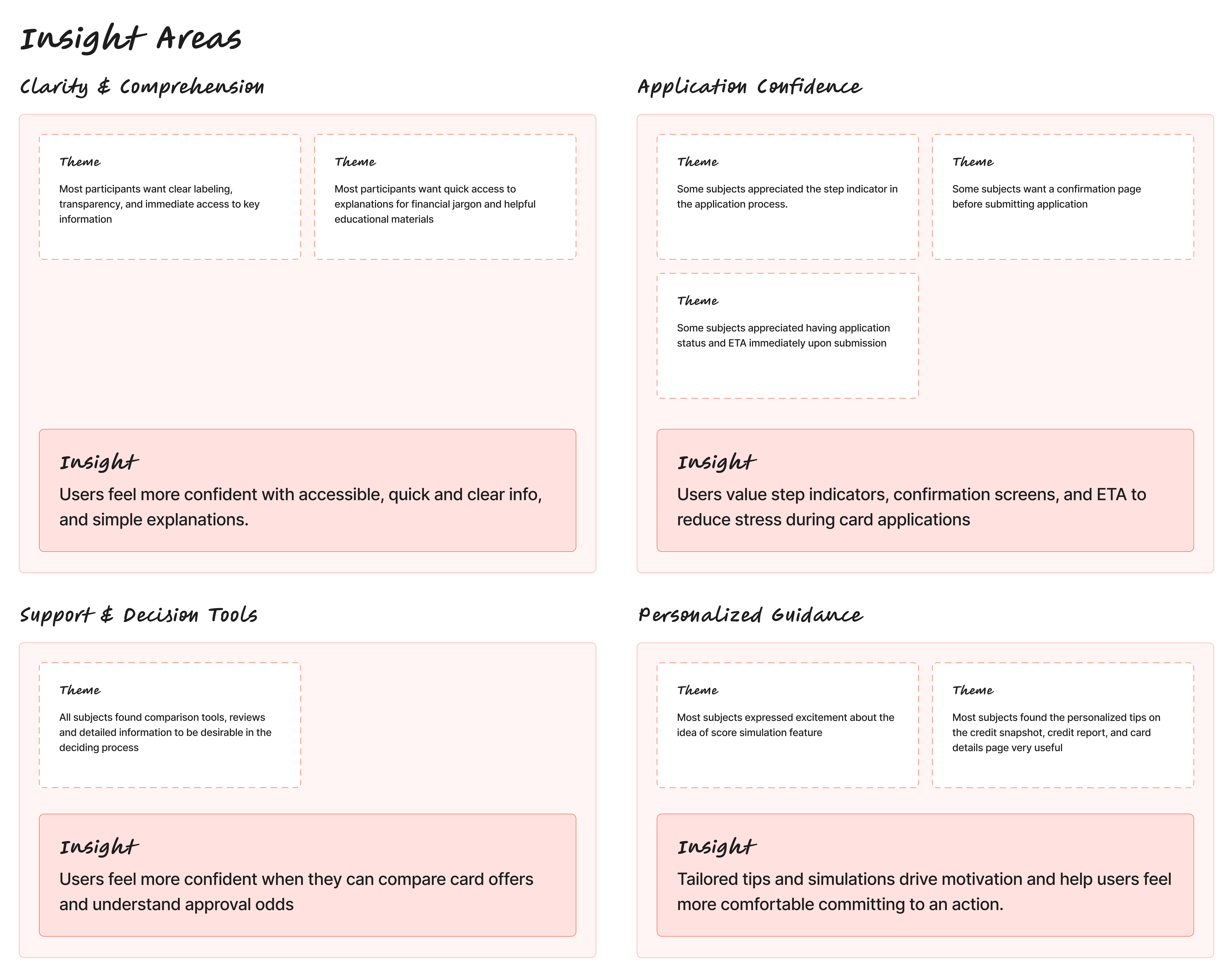
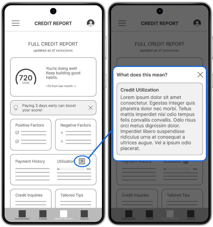
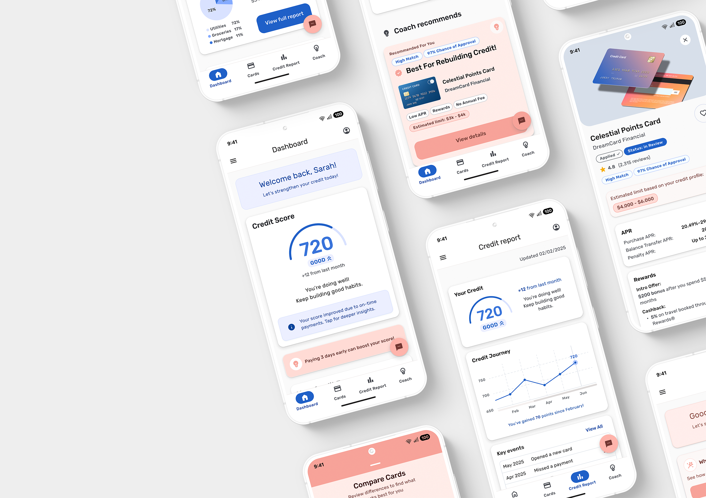
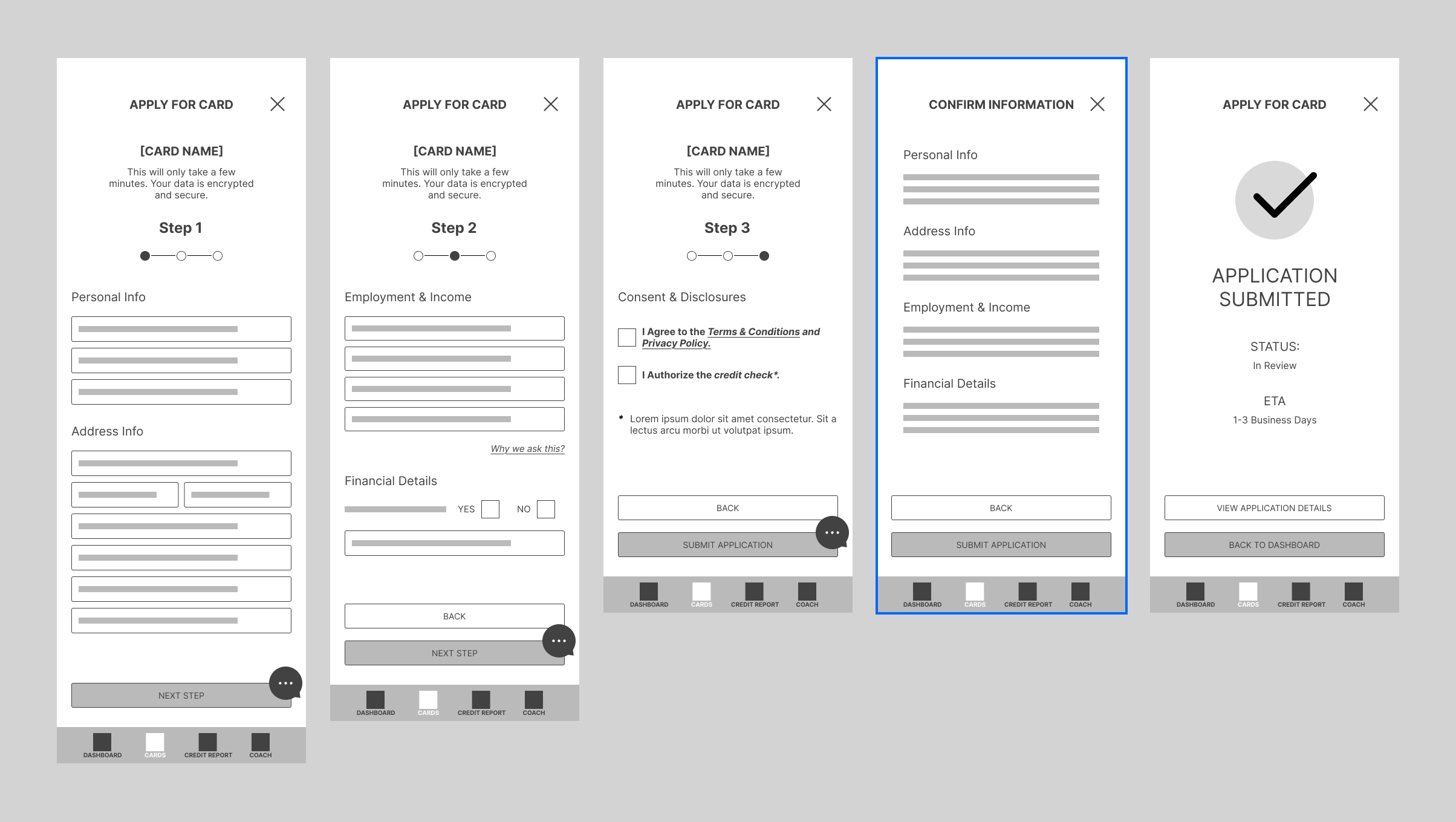
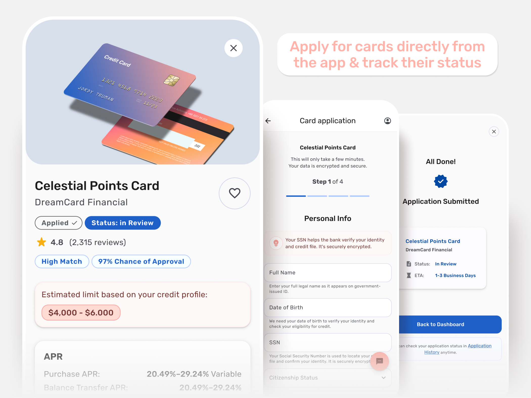
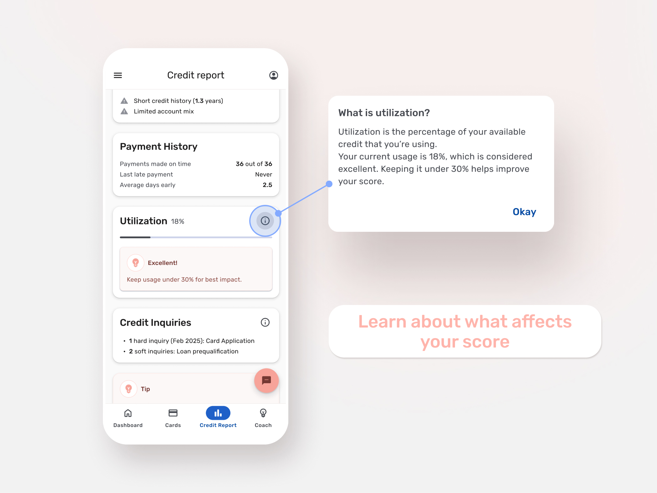
Insight: Transparency Increases Confidence During Applications
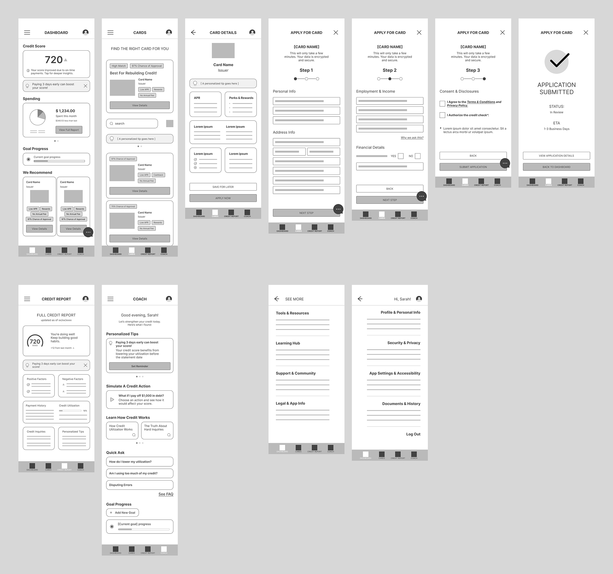
The participant appreciated the step indicators during the application flow, but felt uncomfortable with the lack of confirmation screen before submission.

Answer: Kept the step indicators, application status and ETA, and introduced a confirmation screen.

Multi-step credit card application wireframes including step indicators, review confirmation screen, and application submitted status with ETA.
Updated Application Flow

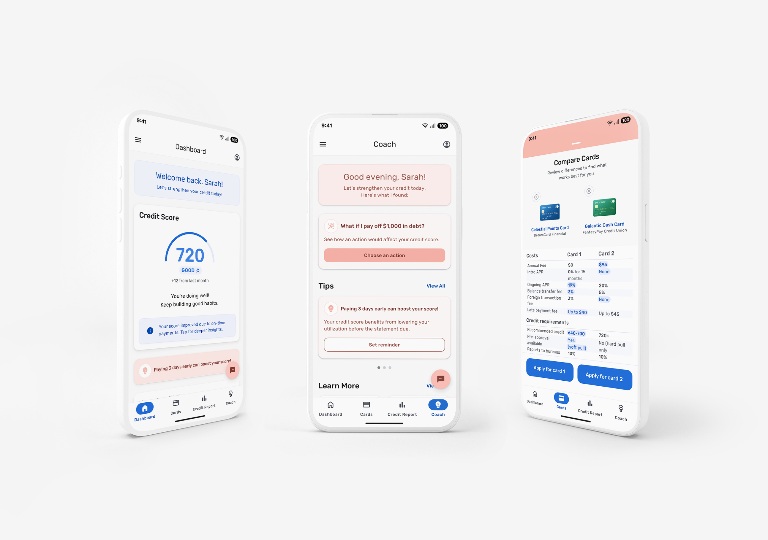
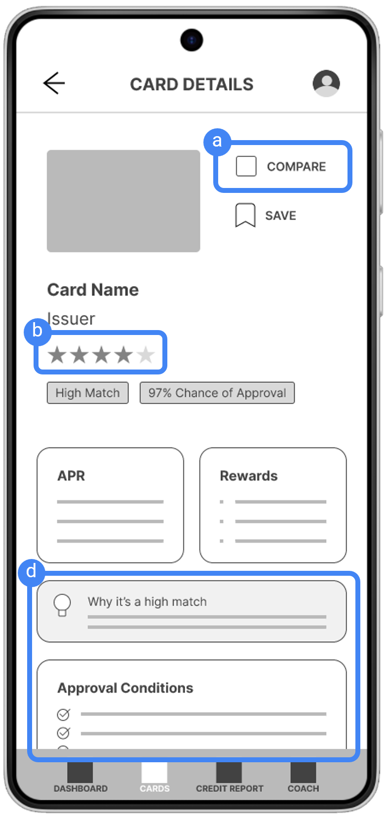
Insight: Users Need Better Tools to Help Them Make Informed Card Choices
The participant feels more confident when they can compare card offers and understand approval odds.

Answer: Added a comparison feature, card ratings, and match criteria and approval chances explanations.

Mobile card details screen featuring a Compare button, star rating, “High Match” label, 97 percent approval chance badge, APR and rewards sections, explanation for why the card is a high match, and listed approval conditions.

Insight: Personalized Guidance Motivates Action
Tailored tips and simulations drive motivation and help users feel more comfortable committing to an action

Answer: Expanded the Coach feature to include actionable advice, reminders, and encouragement.

Two mobile credit report screens showing a 720 credit score with positive and negative factors, tailored tips, and an interactive tooltip explaining credit utilization, demonstrating personalized guidance and educational support within the app.

Low-Fidelity prototype.

Final Designs

The final UI brings clarity, confidence, and calm language together. It uses a clean hierarchy, controlled spacing, and intentional interaction patterns so users spend less time guessing and more time acting.

No items found.

What I learned

This project suggested that emotional reassurance and clear contextual feedback could reduce anxiety. In future, broader testing would be needed to validate these patterns across a wider user group.