Wikibet
A full platform UX overhaul: rebuilding a high-density casino and sports betting product for clarity, consistency, and mobile parity.
A platform rebuilt
from the ground up
Wikibet is an online casino and sports betting platform serving players across desktop and mobile web. As the sole full-time designer, I was responsible for the full scope of UX and UI design, covering the core interface, the component system, and marketing materials.
The platform had an existing desktop interface but no coherent design system, inconsistent components across screens, and a mobile experience that was largely non-functional. Critical features like account management and withdrawal flows were missing entirely.
My work involved rebuilding the interface from the ground up: establishing a unified design system, redesigning core desktop screens, and designing the full mobile experience as a first-class product rather than an afterthought.
desktop + mobile web
the product
end-to-end
UX DesignDesign SystemsMarketing Assets
PhotoshopIllustrator
Design systemDesktop & mobile web
Three problems,
one broken product
Wikibet's existing interface had three fundamental issues that impacted the platform's usability and trustworthiness.
Foundation first
Before redesigning any screens, I established a unified component library covering typography, color tokens, buttons, form fields, navigation states, and notification patterns. Having a system in place ensured consistency across a product with hundreds of screens and two platforms, and gave developers clear implementation guidance throughout the build.
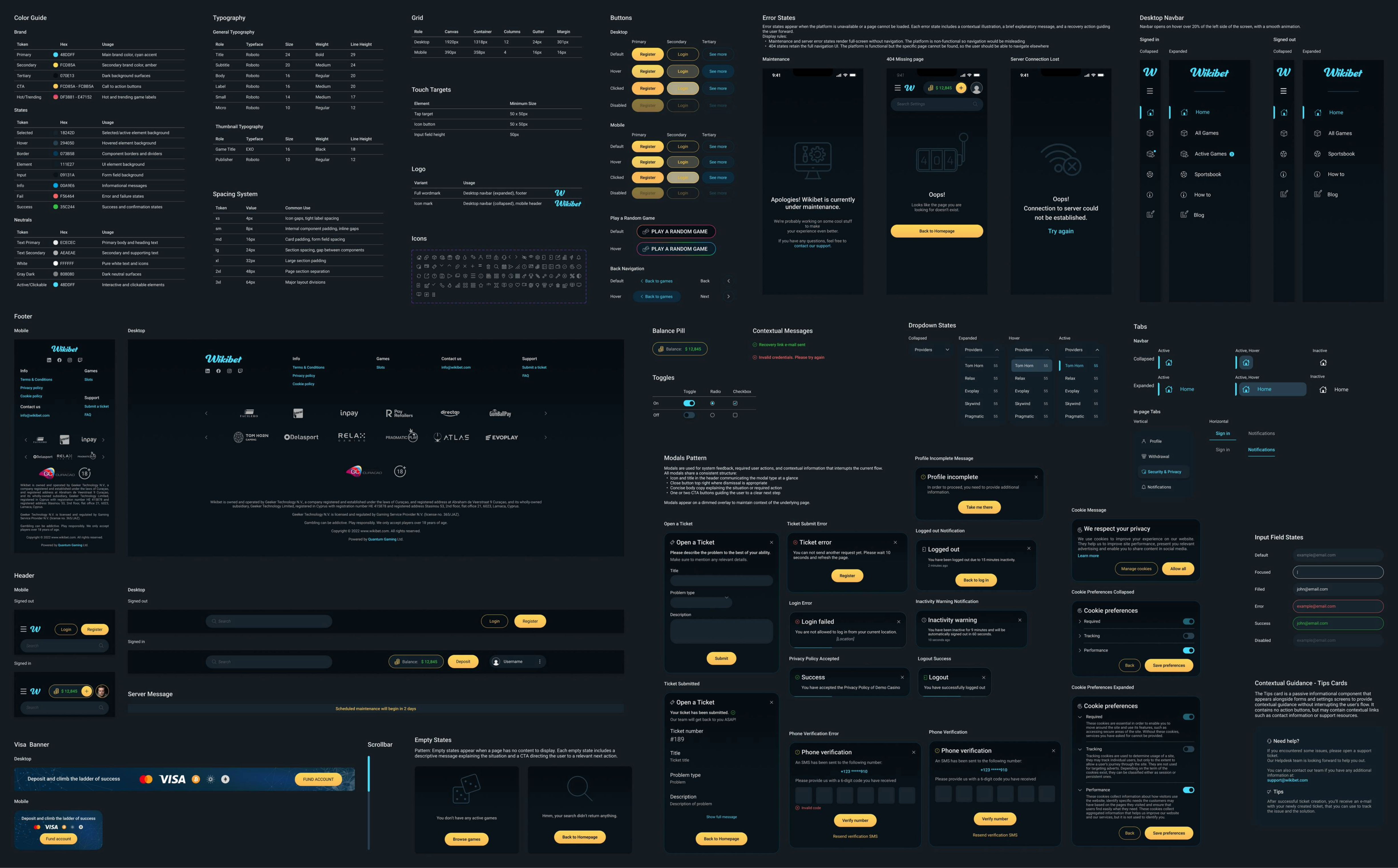 Wikibet design system: color tokens, typography, spacing, components, and patterns
Consistency is infrastructure. It's invisible when it works and painful when it doesn't.
Hierarchy over
density
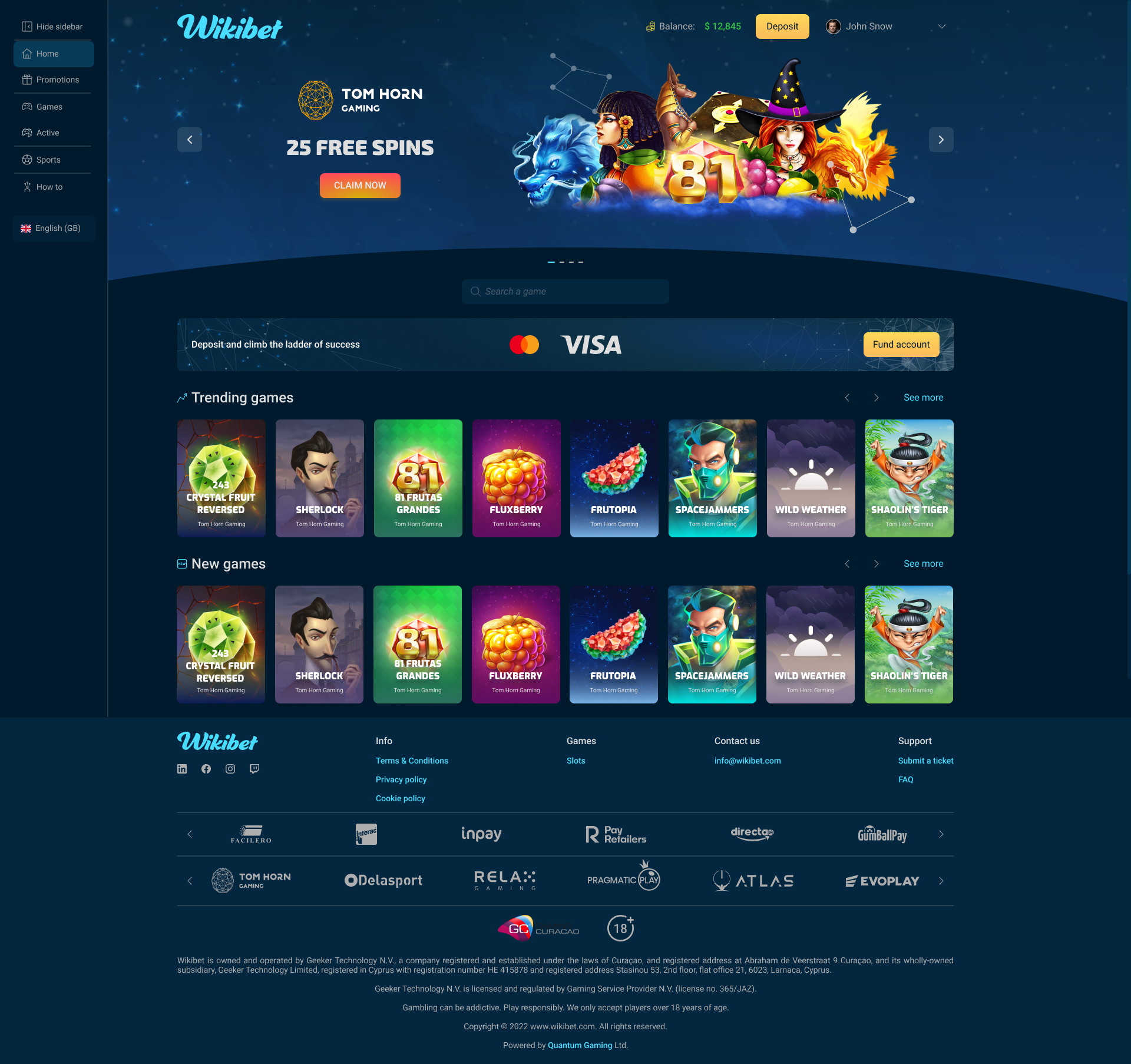
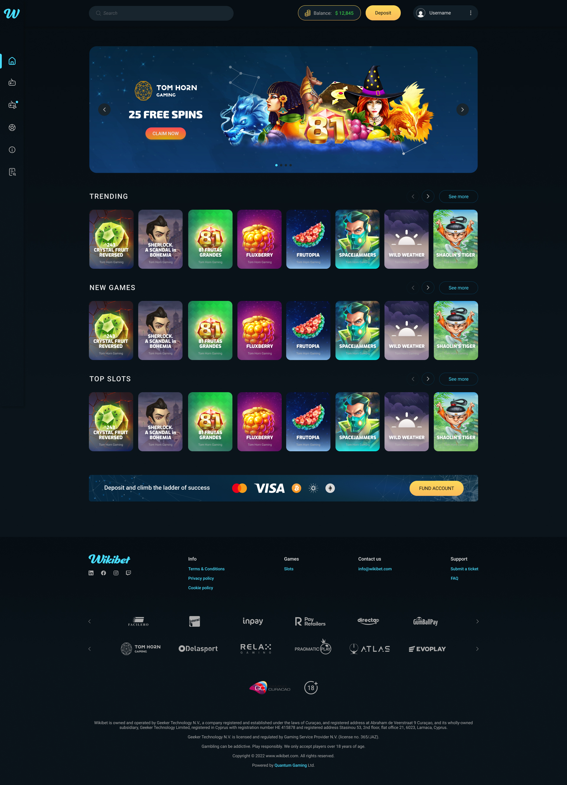
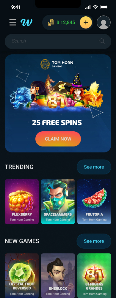
The original homepage suffered from competing visual weight across elements. Navigation, promotional banner, game categories, and payment strip all demanded equal attention, making it difficult for users to orient themselves or find games quickly.
The redesign introduced a collapsed icon sidebar to reduce persistent navigation weight, cleaner category labeling, improved game card sizing for better scannability, and a clearer visual hierarchy that guides users from the promotional banner down through game discovery naturally.
Dense layout with unclear visual hierarchy
Collapsed navigation, clear content hierarchy
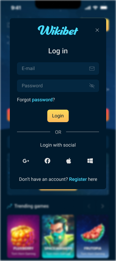
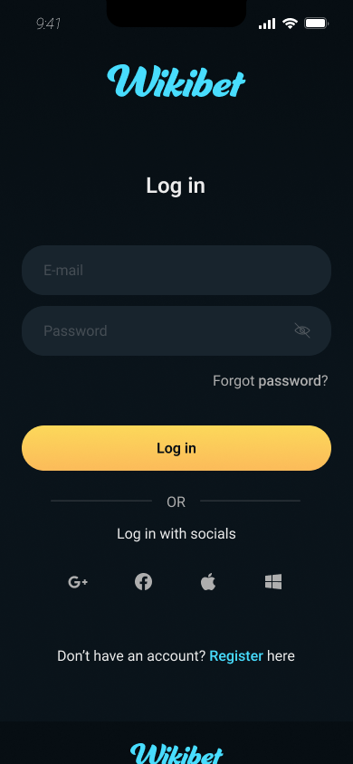
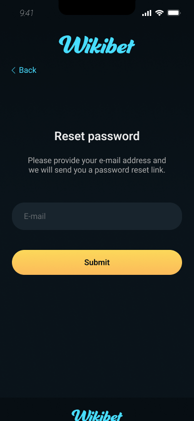
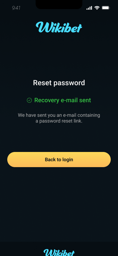
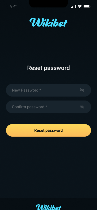
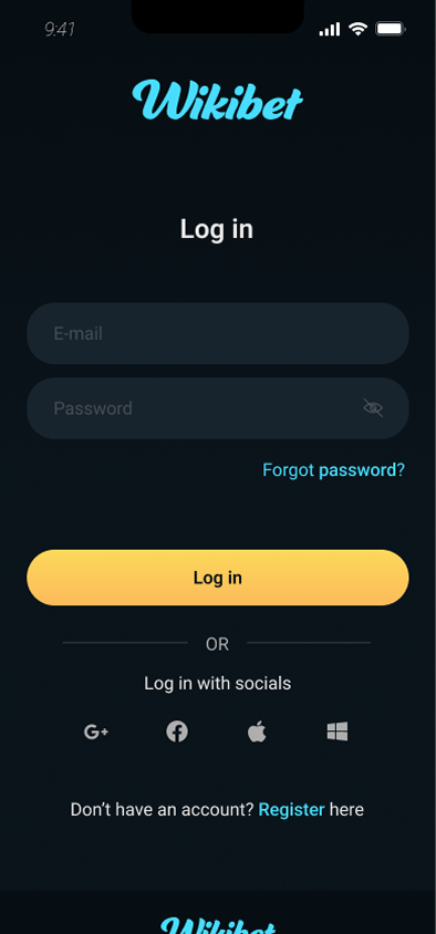
Modals out,
pages in
The original authentication experience used modal dialogs — a pattern that worked reasonably on desktop but created significant usability problems on mobile, where limited space compressed form fields, reduced error message visibility, and made the password recovery sequence difficult to follow.
The redesign replaced modals with dedicated full-screen pages for login, registration, and password reset, giving each step room to breathe, improving inline validation visibility, and reducing cognitive load during a user's first interaction with the platform.
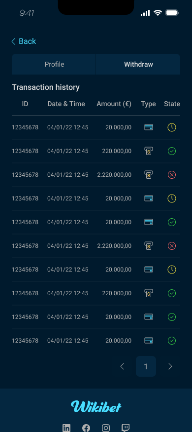
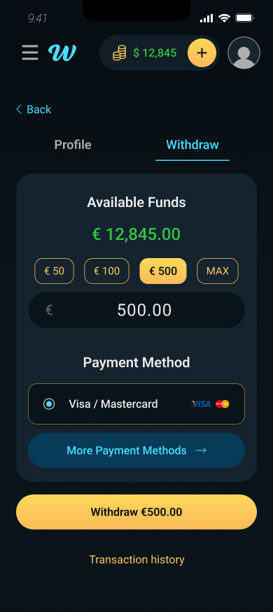
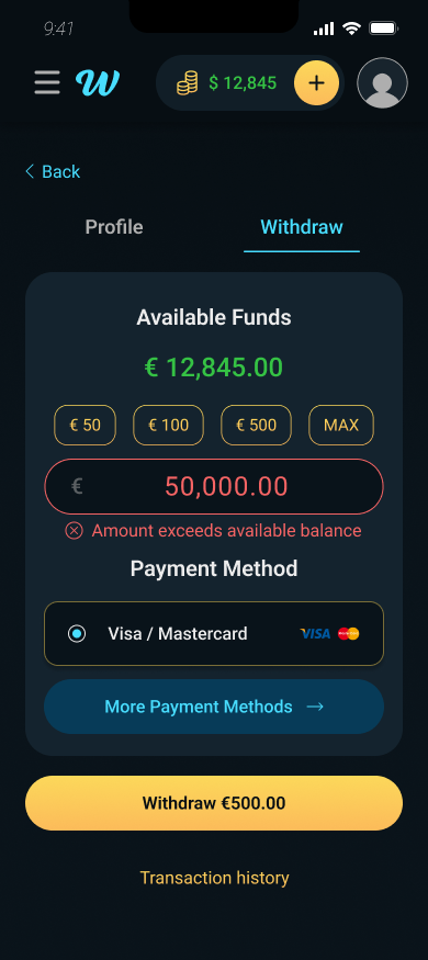
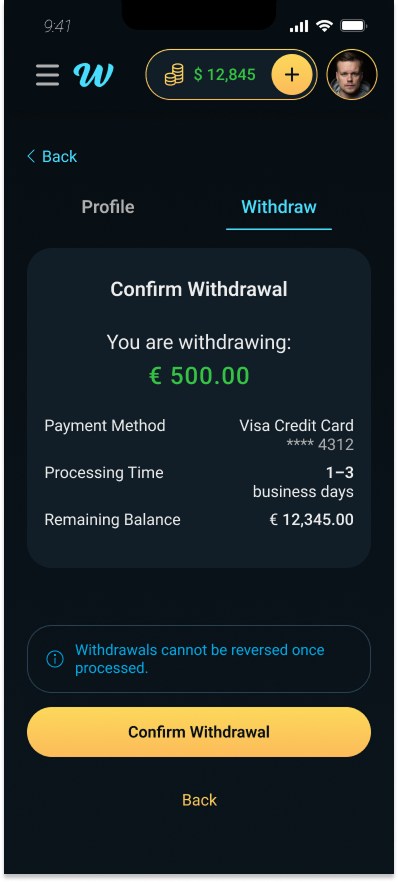
Built from nothing
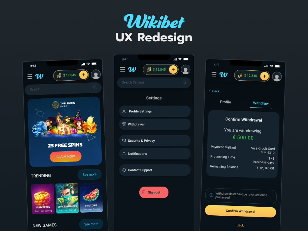
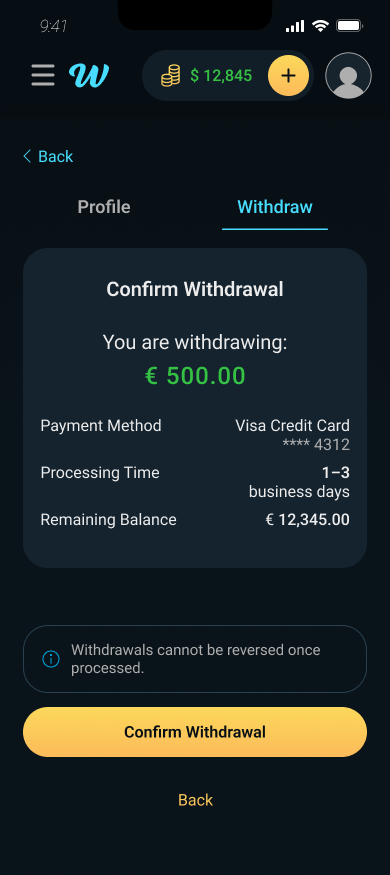
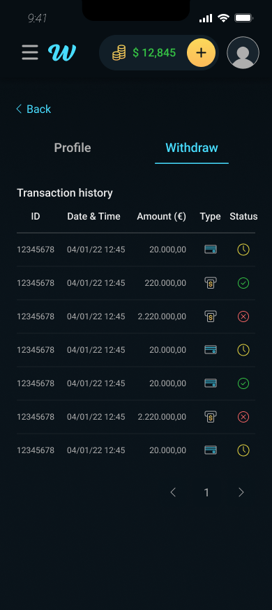
Mobile users had no ability to withdraw funds — the only option was a transaction history table. For a platform handling real money, this was a critical functional gap that forced users to desktop for one of the most important account actions.
The redesign introduced a complete mobile withdrawal flow: available balance display, quick amount presets, manual entry with validation, payment method selection, a confirmation step with full transaction summary, and an error state preventing withdrawals above available balance.
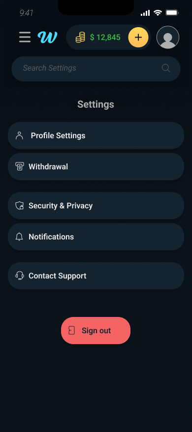
One hub for
everything
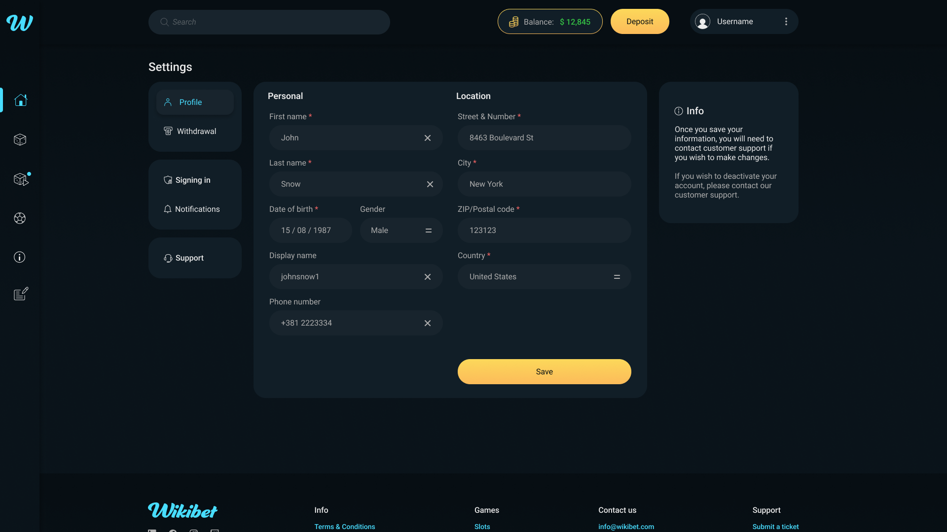
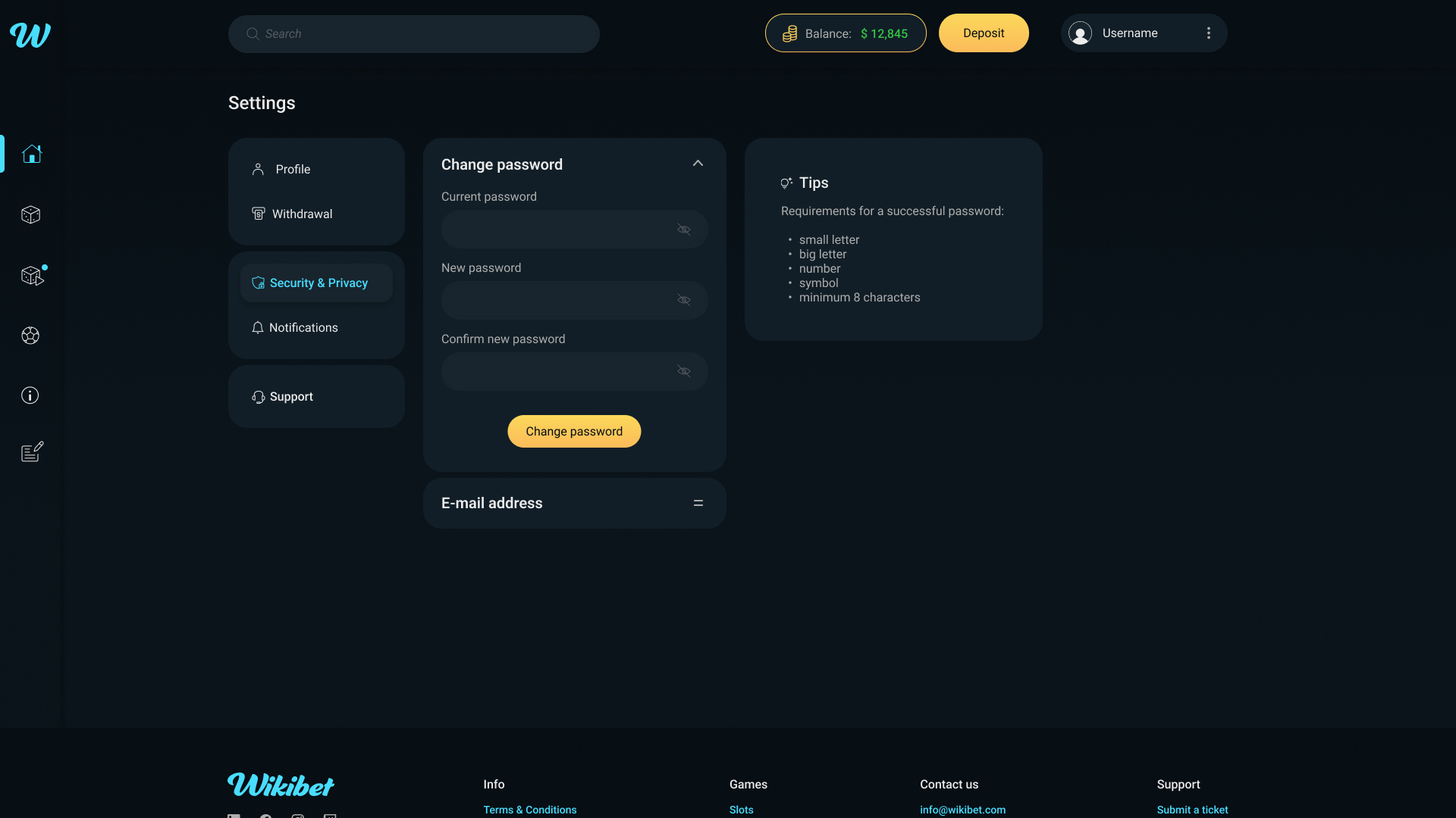
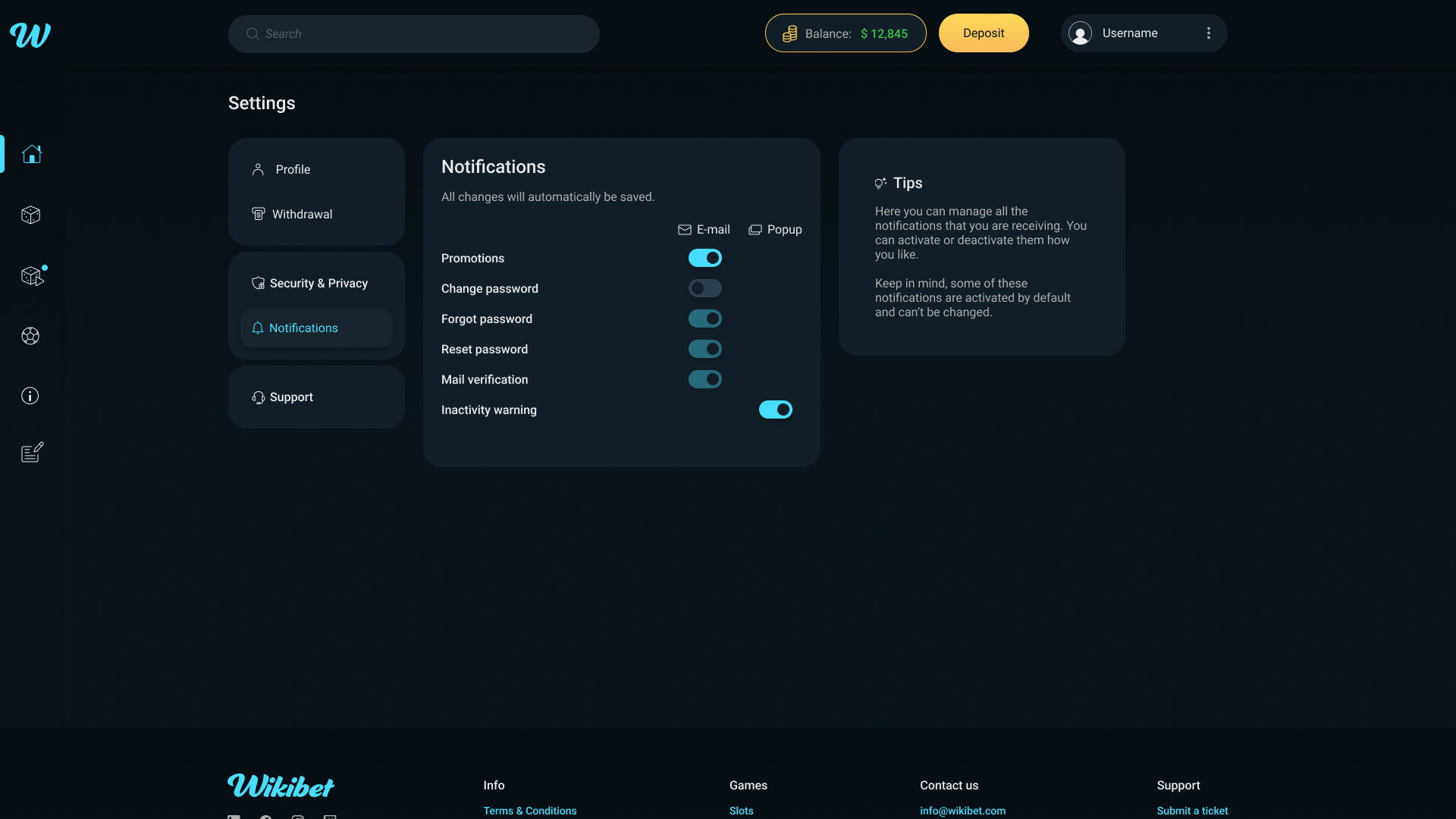
Account management on the original platform had no dedicated home. Profile information, security settings, notifications, and withdrawal functions were accessed through scattered interface elements, giving users no clear mental model of where to find or change critical account information.
The redesign introduced a centralized settings hub with four clearly defined sections: Profile, Security, Notifications, and Withdrawal, all accessible from a single location. Each section uses a consistent accordion pattern that reveals detail without navigating away.
Personal details with inline editing
Password change with contextual guidance
Granular control with clear labeling
Mobile as a
first-class product
Mobile was designed as a complete parallel product, not an adaptation of the desktop interface. Every core user journey — game discovery, account management, financial transactions, authentication, and legal compliance — was designed natively for mobile with appropriate interaction patterns, touch targets, and information hierarchy.

Shipped and
measured
The redesigned platform was fully implemented and launched. The overhaul resulted in measurable conversion improvement, attributed primarily to the introduction of mobile financial flows that previously didn't exist, and the reduction of friction in core user journeys like authentication and account management.
Beyond conversion, the project established a unified design system that gave the development team a consistent implementation reference across a product with hundreds of screens and two platforms, reducing design ambiguity and supporting faster future iteration.
Systems are
infrastructure
Designing a system from scratch inside a live product taught me that consistency is infrastructure. It's invisible when it works and painful when it doesn't. The most impactful decisions weren't visual — they were structural. Defining how components behave, how screens relate, and how flows connect was what made the visual work land.